tecznotes
Michal Migurski's notebook, listening post, and soapbox. Subscribe to ![]() this blog.
Check out the rest of my site as well.
this blog.
Check out the rest of my site as well.
Nov 29, 2012 7:37am
gamma shapes for obama
Back in April, I bailed to Chicago for a week to volunteer with the Obama campaign tech team. It’s the team you’ve read all about, the one CTO’d by Harper Reed that blew the doors off the Romney campaign, and I was unbelievably lucky to spend one too-short week seven months ago working with the group right in their office.
Interestingly, what I ended up working on was a direct descendant of the precinct geometries that Marc Pfister mentioned in the comments of my old post:
We were manually fixing precinct data. We’d look at address-level registration data and rebuild precincts from blocks. A lot of it could probably have been done with something like Clustr and some autocorrelation. But basically you would look at a bunch of points and pick out the polygons they covered.
Clustr is a tool developed by Schuyler Erle and immortalized by Aaron Cope’s work on Flickr alpha shapes:
For every geotagged photo we store up to six Where On Earth (WOE) IDs. … Over time this got us wondering: If we plotted all the geotagged photos associated with a particular WOE ID, would we have enough data to generate a mostly accurate contour of that place? Not a perfect representation, perhaps, but something more fine-grained than a bounding box. It turns out we can.
Schuyler followed up on the alpha shapes project with beta shapes, a project used at SimpleGeo to correlate OSM-based geometry with point-based data from other sources like Foursquare or Flickr, generating neighborhood boundaries that match streets through a process of simple votes from users of social services. For campaign use, up-to-date boundaries for legislative precincts remains something of a holy grail. We would need an evolution of alpha- and beta-shapes that I’m going to go ahead and call “gamma shapes”.
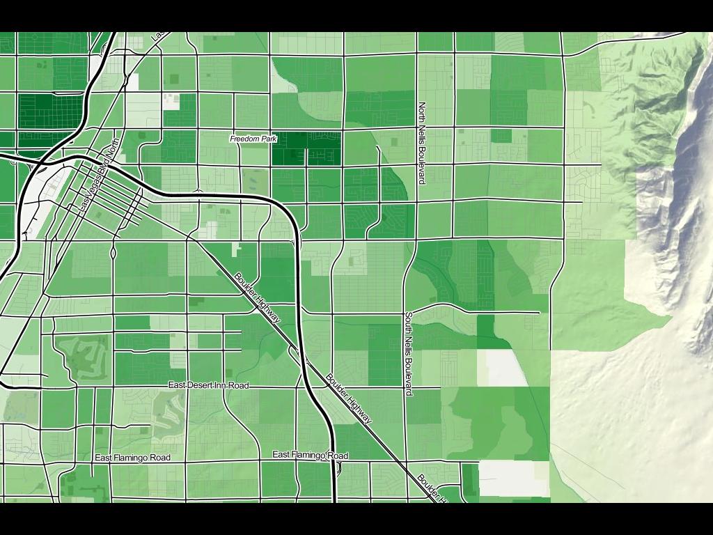
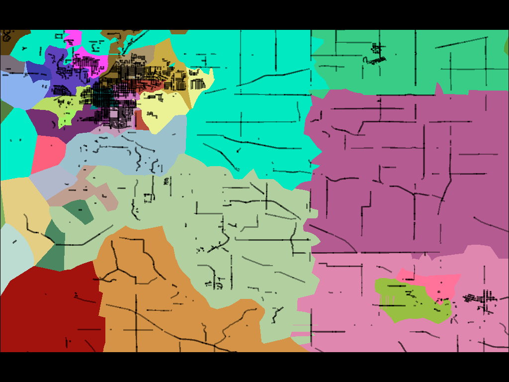
Gamma shapes are defined by information from the Voter Information Project, which provides data from secretaries of state who define voting precincts prior to election day. While data providers like the U.S. Census provide clean shapefiles for nationwide districts, these typically lag the official definitions by many months, and those official definitions are in notable flux in the immediate lead-up to a national election. Everything was changing, and we needed a picture like this to accurately help field offices before November 6:
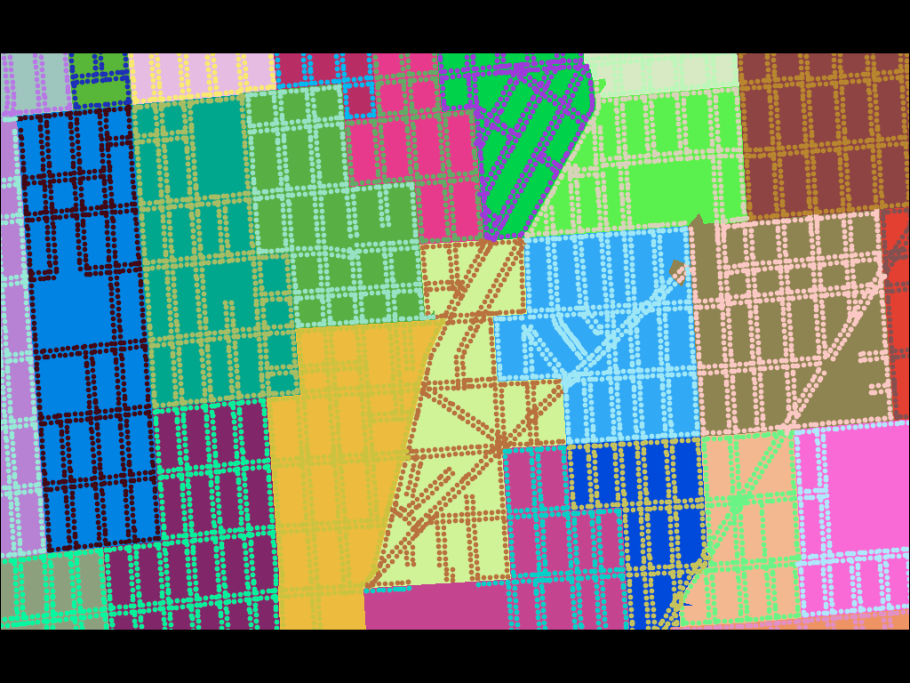
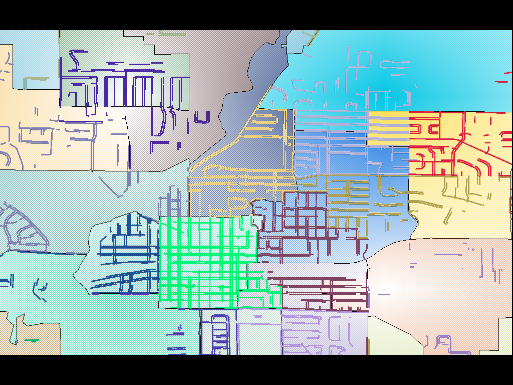
Unlike Flickr and SimpleGeo’s needs, precinct outlines are unambiguous and non-overlapping. It’s not enough to guess at a smoothed boundary or make a soft judgement call. As Anthea Watson-Strong and Paul Smith showed me, legislative precincts are defined in terms of address lists, and if your block is entirely within precinct A except for one house that’s in B, that’s an anomaly that must be accounted for in the map, such as this district with a weird, non-contiguous island:
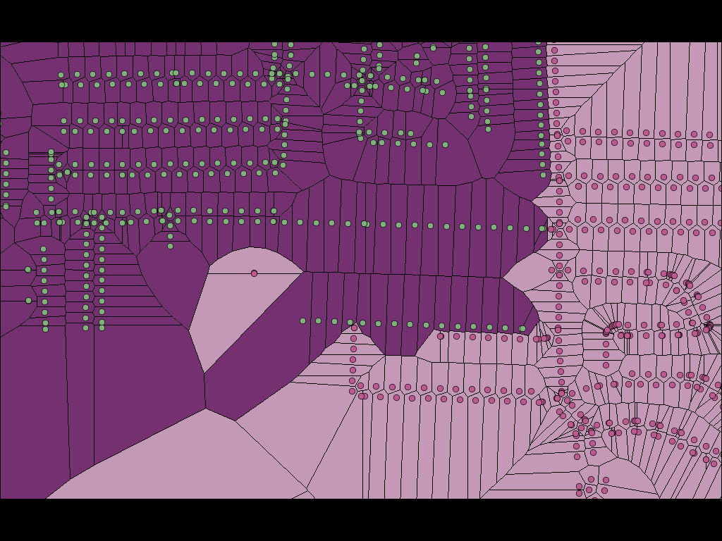
The shapes above should look familiar to you if you’ve ever seen the Voronoi diagram, one of this year’s smoking-hot fashion algorithms.
When you remove the clipping boundaries defined by TIGER/Line, you reveal a simple Voronoi tessellation of our original precinct-defining address points, each one with a surrounding cell of influence that shows where that precinct begins and ends. Voronoi allows us to define a continuous space based on distance to known points, and establishes cut lines that we can use to subdivide a TIGER-bounded block into two or more precincts. In most cases it’s not needed, because precinct boundaries are generally good about following obvious lines like roads or rivers. Sometimes, for example in cases of sparse road networks outside towns or demographic weirdness or even gerrymandering, the Voronoi are necessary.
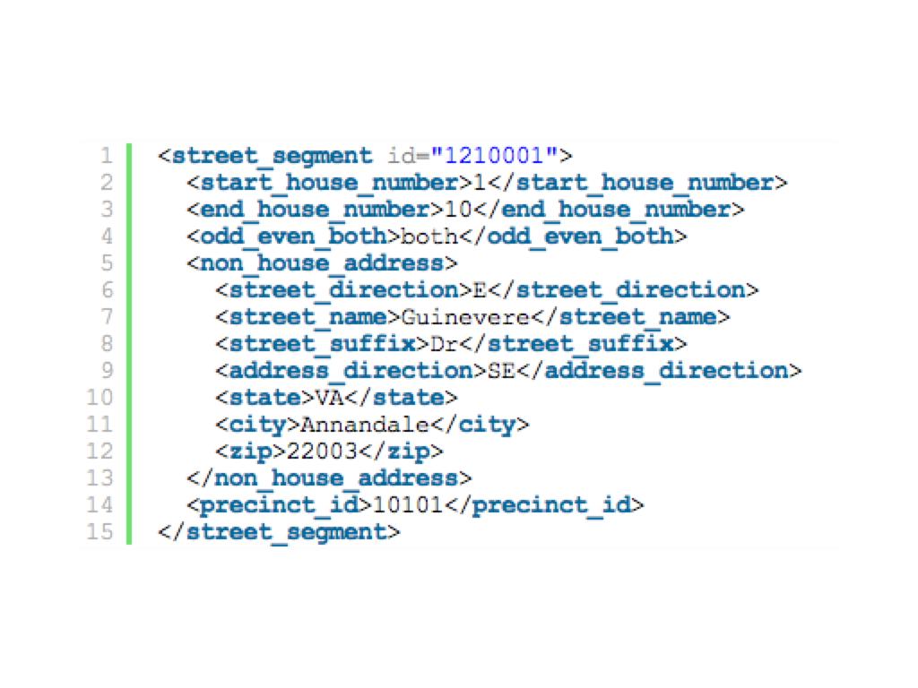
The points in some of the images below are meant to represent individual address points (houses), but for most states precincts are defined in terms of address ranges. For example, the address numbers 100 through 180 on the even side of a street might be one precinct, while numbers 182 though 198 are another. In these case, I’m using TIGER/Line and Postgis 2.0’s new curve offset features to fake a line of houses by simply offsetting the road in either direction and clipping it to a range.
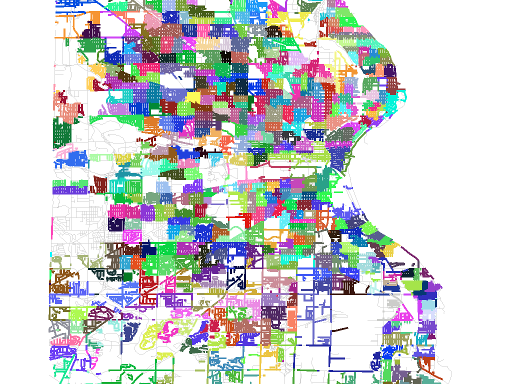
For a large city, such as this image of Milwaukee, there can be hundreds of precincts each just a few blocks in size:
In the end, the Voter Information Project source data ended up being of insufficient quality to support an accurate mapping operation, so this work will need to continue at some future date with new fresh data. Precincts change constantly, so I would expect to revisit this as a process rather than an end-product. Sadly, much of the code behind this project is not mine to share, so I can’t simply open up a repository as I normally would. Next time!

subscribe to ![]() this site.
|
contact Michal Migurski
this site.
|
contact Michal Migurski