tecznotes
Michal Migurski's notebook, listening post, and soapbox. Subscribe to ![]() this blog.
Check out the rest of my site as well.
this blog.
Check out the rest of my site as well.
Aug 30, 2015 9:54pm
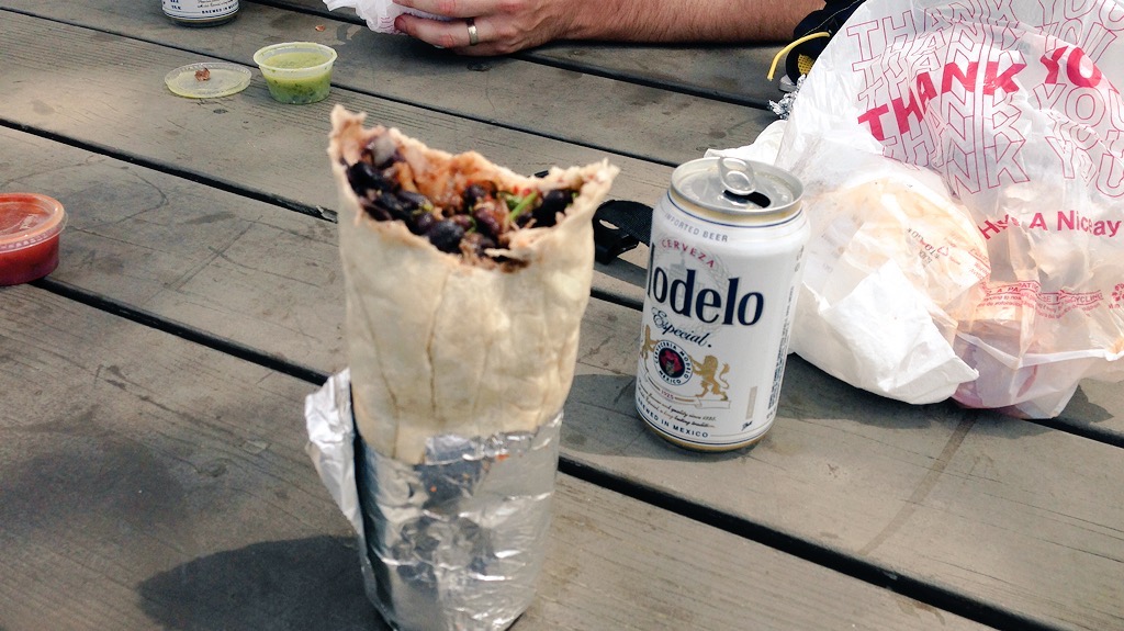
the bike rack burrito n’ beer box
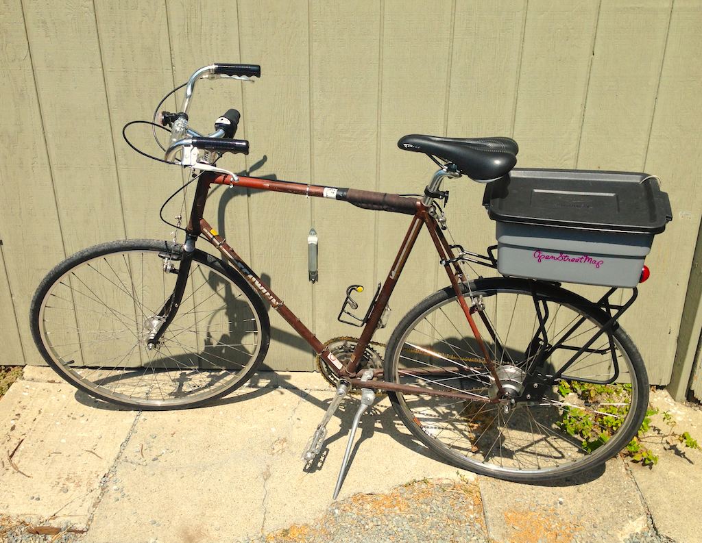
For bike day trips, keep a six-pack of beer cans cold and three burritos hot with this insulated rack-mountable box.

I switched the Schwinn touring bike from a front basket to a rear-mounted rack, and assembled this insulated box using $20 in parts from a hardware store and an art supply store. It should work for any rear-mounted bicycle rack with a flat top.
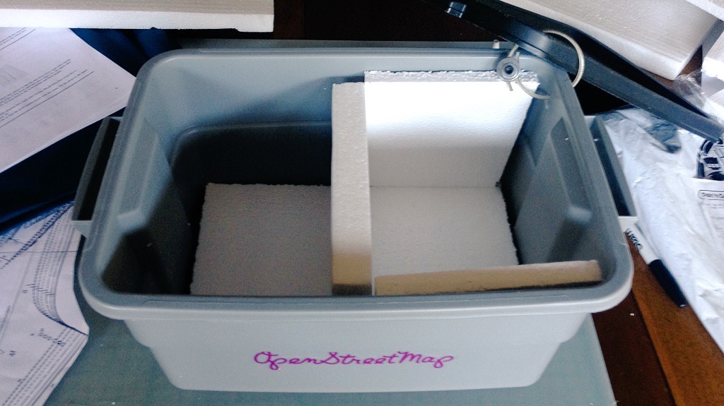
The box is a Rubbermaid 3 Gallon tote. Home Depot sells them for $5.27:

The insulation is plain styrofoam. I had a few sheets of 1" foam around the house, but it was slightly too thick to fit into the box leaving room for the six-pack (5.2" × 7.8" × 4.83"). Michael’s Art Supplies sells 5/8" sheets for an extortionate $5 apiece; two 12" × 12" sheets were enough for the sides:
Use a sharp utility knife to cut the foam. The tote tapers slightly toward the bottom and has curved corners, so use the knife to trim off a bit of the bottom and corners of each of the four side panels until a six-pack fits snugly into the box:
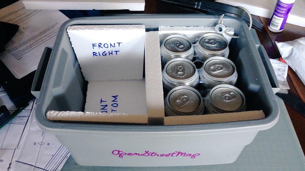
I labeled each of the panels so I wouldn’t be confused about how to fit them in, and wrapped the cut edges with clear packing tape so bits of styrofoam wouldn’t fly all over the place.
To mount the box to the rack, mark four points on the bottom of the tote box up against the inside corners of the rack top; it will look like this from the bottom when you’re done:
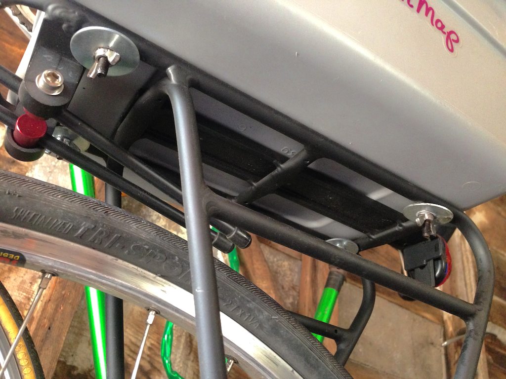
Each mount point is made from a three washers, a screw, and a wingnut.

The screw here is fairly long, to make it possible to attach and detach the tote box without removing the wingnuts completely. They can simply be unscrewed, and the natural flexibility of the tote container will make it possible to bend the large washers around the rack. I use large fender washers to catch a complete interior corner of the rack on the bottom, and to distribute the stress on the bottom of the tote box. Smaller washers will distort the box and allow the screws to bend until they detach from the box while riding over bumps.
Make a sandwich from the washers, and use the tiny one to capture the screw head at top:

I used metric M5 screws for everything, to match most other bike components.
When you drill the four holes you’ve marked on the bottom of the box, use a bit slightly narrower than the screw threads so everything fits tightly. This should keep water from splashing up into the box from below, if you ride in the wet.
I tested the box on day-long ride in July. We started out with cans cold from the fridge and burritos hot from Burrito Express at 10am, and ascended Palomares Road over the next couple hours. We descended into Fremont, and made our way west along Alameda Creek to Coyote Hills Park where we stopped to eat around 3pm. After five hours in near 90° heat, the burritos were deliciously hot and the beers were acceptably cold.
Aug 15, 2015 6:08pm
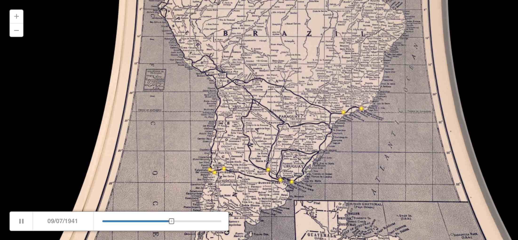
a historical map for moving bodies, moving culture
Similar to my quick adaptation of OSM data the other day, Kate Elswit recently asked for data and mapping help with her Moving Bodies, Moving Culture project. MBMC is a series of exploratory visualizations all based on the 1941 South American tour of American Ballet Caravan. The goal here was to adapt a Rand McNally road atlas from 1940 as a base map for the tour data, to “to see how different certain older maps might be, given some of the political upheaval in South America in the past 80 years.”
Kate is using Github to store the data, and I’ve written up a document explaining how to do simple map warping with a known source projection to get an accurate base map.
This is a re-post of the process documentation.
Start by downloading a high-res copy of the Rand McNally 1940 map. Follow the image link to the detail view:

Vector Data and QGIS
This downloads a file called 5969008.jpg.
Download vector data from Natural Earth, selecting a few layers that match the content of the 1940 map:
The projection of the 1940 map looks a bit like Mollweide centered on 59°W, so we start by reprojecting the vector data into the right PROJ.4 projection string:
ogr2ogr -t_srs '+proj=moll +lon_0=-59' \
    ne_50m_admin_0_countries-moll.shp \
    ne_50m_admin_0_countries.shp

ogr2ogr -t_srs '+proj=moll +lon_0=-59' \
    ne_50m_populated_places-moll.shp \
    ne_50m_populated_places.shp

ogr2ogr -t_srs '+proj=moll +lon_0=-59' \
    ne_50m_graticules_5-moll.shp \
    ne_50m_graticules_5.shp
In QGIS, the location can be read from the coordinates display:

Warping The Map
Back in the 1940 map, corresponding pixel coordinates can be read from Adobe Photoshop’s info panel:

Using GDAL, define a series of ground control points
(GCP) centered on cities
in the Natural Earth data and the 1940 map. Use gdal_translate
to describe the downloaded map and then gdalwarp
to bend it into shape:
gdal_translate -a_srs '+proj=moll +lon_0=-59' \
    -gcp 1233 1249 -1655000 775000 \
    -gcp 4893 2183 2040000 -459000 \
    -gcp 2925 5242 52000 -4176000 \
    -gcp 1170 3053 -1788000 -1483000 \
    -gcp 2256 6916 -767000 -6044000 \
    -of VRT 5969008.jpg 5969008-moll.vrt

gdalwarp -co COMPRESS=JPEG -co JPEG_QUALITY=50 \
    -tps -r cubic 5969008-moll.vrt 5969008-moll.tif
Opening the result in QGIS and comparing it to the 5° graticules shows that the Mollweide guess was probably wrong:

The exactly horizontal lines of latitude in the original map suggest a pseudocylindrical projection, and a look at a list of examples shows that Sinusoidal might be better. Try it all again with a different PROJ.4 string:
ogr2ogr -t_srs '+proj=sinu +lon_0=-59' \
    ne_50m_admin_0_countries-sinu.shp \
    ne_50m_admin_0_countries.shp

ogr2ogr -t_srs '+proj=sinu +lon_0=-59' \
    ne_50m_populated_places-sinu.shp \
    ne_50m_populated_places.shp

ogr2ogr -t_srs '+proj=sinu +lon_0=-59' \
    ne_50m_graticules_5-sinu.shp \
    ne_50m_graticules_5.shp
The pixel coordinates will be identical, but the locations will be slightly different and must be read from QGIS again:
gdal_translate -a_srs '+proj=sinu +lon_0=-59' \
    -gcp 1233 1249 -1838000 696000 \
    -gcp 4893 2183 2266000 -414000 \
    -gcp 2925 5242 52000 -3826000 \
    -gcp 1170 3053 -1970000 -1329000 \
    -gcp 2256 6916 -711000 -5719000 \
    -of VRT 5969008.jpg 5969008-sinu.vrt

gdalwarp -co COMPRESS=JPEG -co JPEG_QUALITY=50 \
    -tps -r cubic 5969008-sinu.vrt 5969008-sinu.tif
The results looks pretty good:

Cutting Tiles
For web map display, convert the warped map to map tiles using
gdal2tiles.py
starting at map zoom level 6:
gdal2tiles.py -w openlayers -z 0-6 \
    -c 'Rand McNally 1940' -t 'Map of South and Central America' \
    5969008-sinu.tif tiles
Convert all generated PNG tiles to smaller JPEG images using Python and convert:
python convert-tiles.py
Here it is in CartoDB:
Aug 13, 2015 6:15am
the other openstreetmap churches post
Scott Murray wrote the other day asking about getting Church data out of OpenStreetMap:
What is the easiest way to extract a list of a specific type of features from OSM for a particular area? For example, say I want all of the churches ( feature type: building / church ) in London, and the name, lat, and lon for each. Ideally all of this would end up in a simple CSV. This would be a one-time extract, and I don’t need to update it again later.
It was a pretty quick process, so I wrote it up for him and asked his permission to re-post here. I figured others might run into the same need. Today, Steven Vance in Chicago posted a response to a near-identical question with a different approach. There are many ways to skin this cat, and possibly not enough guides on this kind of retail data extraction from OpenStreetMap.
This is what I sent to Scott:
Since you’re asking for a major urban area, I would expect that London is part of the Mapzen metro extracts.
I downloaded a copy of the London OSM2PGSQL SHP data, because I know that it tends to be a closer (and often messier) representation of what’s in the OSM source database. If I was looking for roads or something else that I felt confident was already a defined and separate layer, I would download the IMPOSM SHP data. If I was looking for something outside a covered city, then I’d need to go digging in the Planet and I would be sad (edit: I’d follow Steven’s advice).
Next I looked on the OSM wiki to see how churches are tagged. The suggested tag is amenity = place_of_worship.
Then I used ogr2ogr, a tool in the GDAL family, to quickly peel out all the tag matches. I could do this interactively in QGIS as well, but I find the command line to be a speedier way to get what I want. ogr2ogr can be a pain in the butt to install, but I’ve found that it’s something of a secret hidden easter egg in Postgres.app, so if you install that you can find ogr2ogr hidden inside.
Here’s the conversion to get the OSM ID and the name for all places of worship:
ogr2ogr \
    -select 'osm_id, name' \
    -where "amenity = 'place_of_worship’” \
    london_england_osm_point-amenity-place_of_worship.shp \
    london_england_osm_point.shp
At this point I opened the shapefile in QGIS to see what’s there, and saw this this:

That looks right, so I convert it to a CSV preserving the geometry in (Y, X) fields, also using ogr2ogr:
ogr2ogr \
    -f CSV -lco GEOMETRY=AS_YX \
    london_england_osm_point-amenity-place_of_worship.csv \
    london_england_osm_point-amenity-place_of_worship.shp
Aug 9, 2015 4:51pm
platforminess, smartness, and meaningfulness
This week, I’ll be speaking at two Bay Area tech events:
On Wednesday, IxDA San Francisco is hosting Making Data Meaningful, where I’ll be joining designers from Facebook, Automatic, and Jawbone to talk about meaning and data.
On Thursday, SAP is hosting Accelerating Smart Cities in Palo Alto, where I’ll be joining a (regrettably all-male) group of technology and government experts to talk about smartness and cities.
This is me trying to get some thoughts straight while I prepare.
When I first met my now-boss Jen Pahlka and got excited about Code for America, it was 2010 and Tim O’Reilly was starting to unveil his “government as a platform” meme. For tech people like me, it’s an evocative and potent image and I’ve been wondering why. The UK’s Government Digital Service made this video to attempt an explanation, and it misses the mark:
I’ve been re-reading Science in Action. Eight years later, there are a lot of ideas in Latour’s book directly applicable to what makes a platform and what’s missing from the GDS video. Latour uses the Roman two-faced god Janus as a recurring illustration, contrasting ready-made science that you learn in a school textbook with science-in-the-making that you learn in the news.
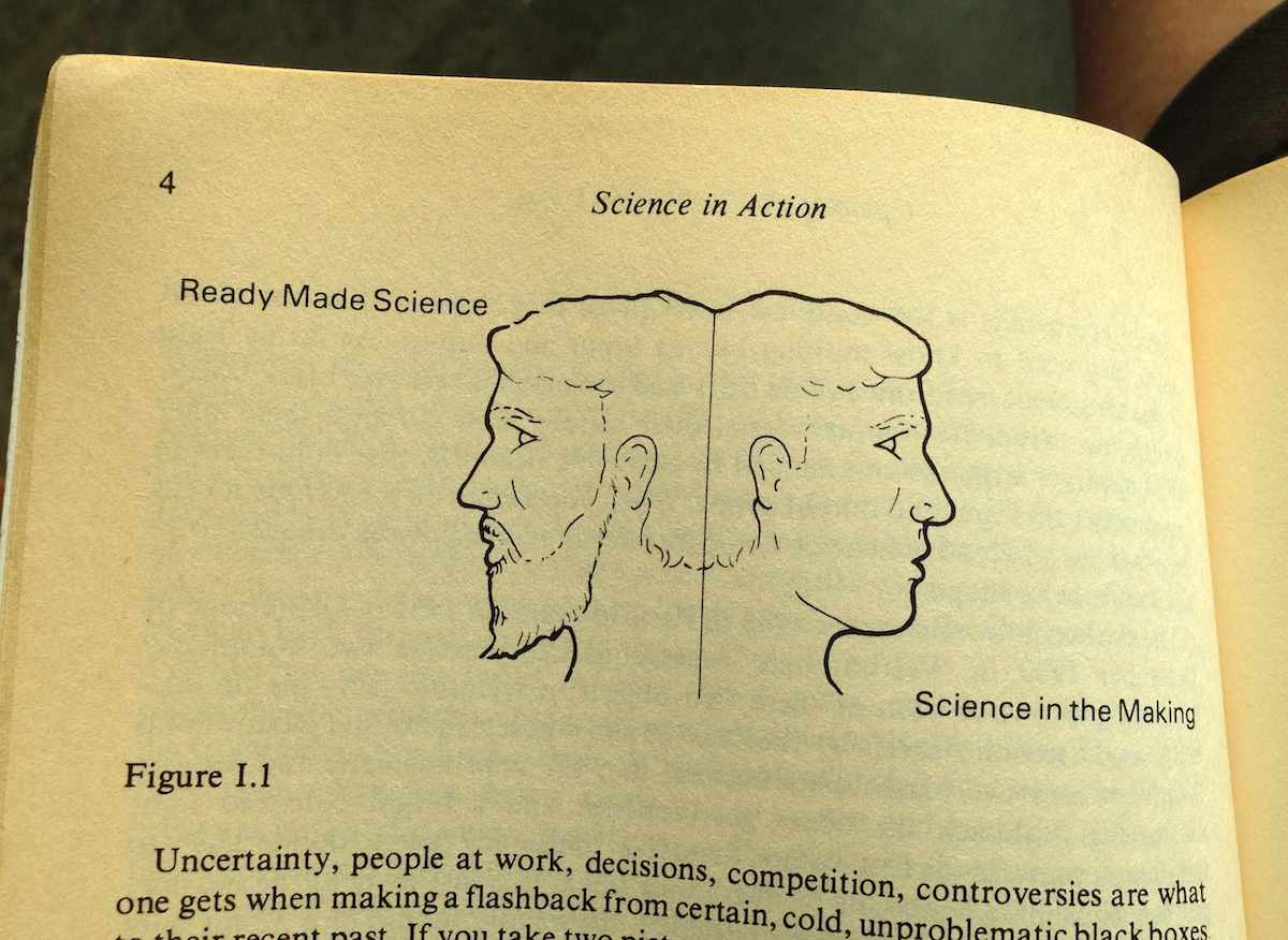
Uncertainty, people at work, decisions, competition, controversies are what one gets when making a flashback from certain, cold, unproblematic black boxes to their recent past. If you take two pictures, one of the black boxes and the other of the open controversies, they are utterly different. They are as different as the two sides, one lively, the other severe, of a two-faced Janus. “Science in the making” on the right side, “all made science” or “ready made science” on the other; such is Janus bifrons, the first character that greets us at the beginning of our journey.
The Janus illustration appears repeatedly, showing the difference between settled facts on the left and the process by which they’re made on the right:
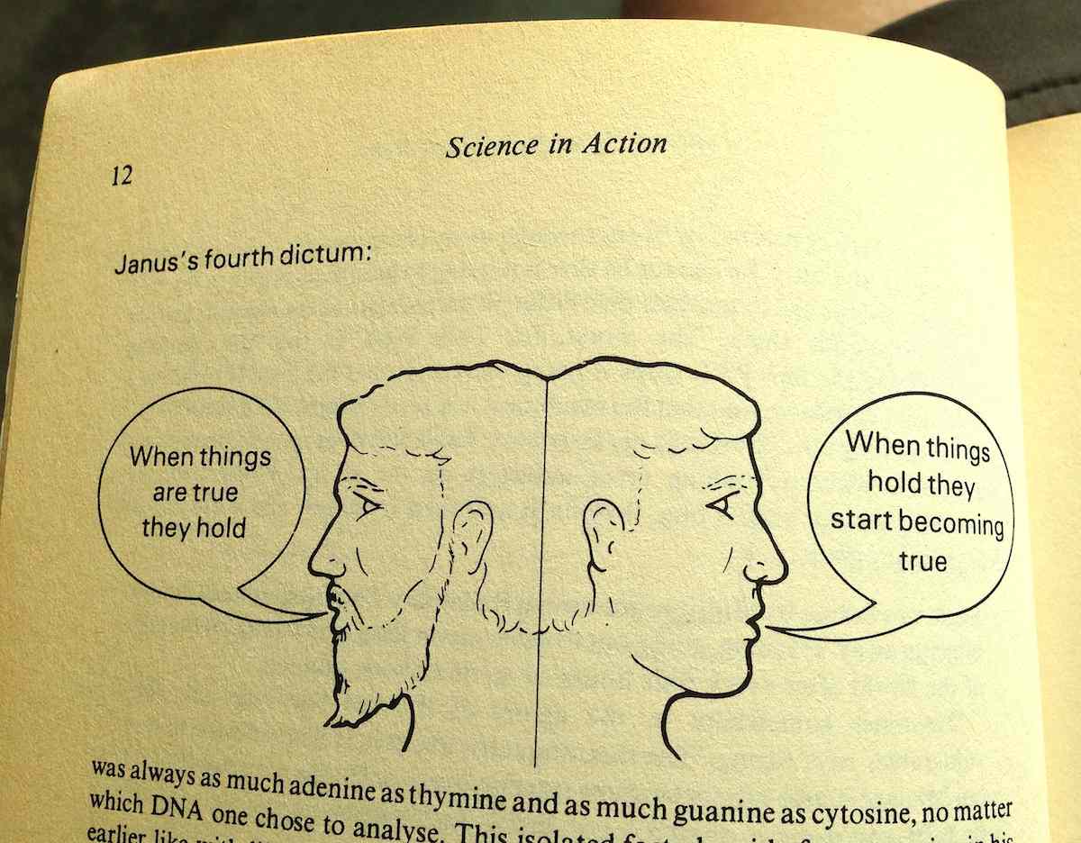
On the right is where the messy controversies of science and technology happen, and usually they’re in the form of suggested truths being put to a test. When things “hold,” they work for new people in new contexts. The chemist’s double-helix shape of DNA is used by the biologist to explain how genetic information is copied. Pasteur’s work on bacterial vaccines is used by farmers to keep their sheep and cows alive. The GDS video shows the platforminess of technology as a settled truth with neatly-shaped blocks, but without those other people using the platform for support it doesn’t mean anything.
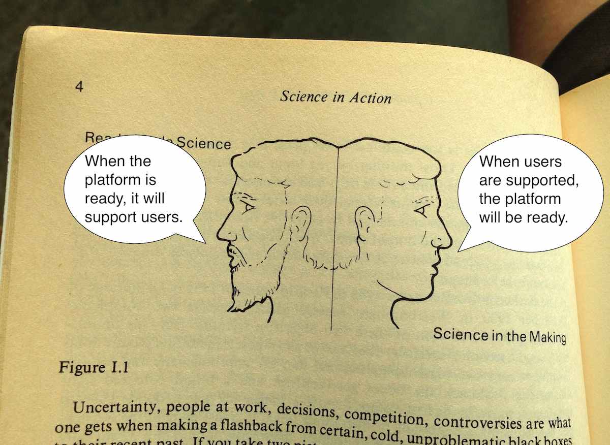
So, nothing is a platform until it’s used as one.
Meanwhile, there are a few potential visions of what a government platform might look like. Specific actors work on the right side of Janus developing and promoting visions to make them real. The winning bingo words are “big data,” “smart cities,” “internet of things,” and so on.
Adam Greenfield (author of Against The Smart City) ties a few of these threads together in a recent edition of his weekly email letter:
So the idea that we will somehow use the data we garner to “make wiser decisions” about our own lives is something I find naive at best. If other parties will almost always better be able to use data to act in ways that are counter to my interests (and even do me harm!) than I will be able to marshal the time, effort and energy to use them in ways that advance my interests, then the house always wins. And this is particularly problematic as one failing “smart city” initiative after another gets reframed and repositioned as an “urban IoT” project.
The initiatives fail to hold, and are recast into new initiatives.
Government has always had high potential for running platforms, because platforms are essentially made of regulations. The web platform is a set of rules for how markup, addresses, and state transfers work together. The Amazon services platform is a set of rules for how computers, networks, and credit cards work together. The Interstate Highway platform is a set of rules for how roads, tax dollars, and cars work together. All those pieces can be swapped out, but the rules that bind them hold. In the GDS video metaphor, rules might specify the acceptable size and weight of a block but not its material or color. It should reference the idea of other people in the picture, the potential for new actors to use those blocks for support.
Where government has failed at platforms is in delivery. Outgoing GDS director Mike Bracken immortalized their approach with his “Strategy is Delivery” meme, jumping the gap between isolated rule-setting and the services that deliver those rules. Implementation is a pre-digital, book-length exploration on the same theme from 1973: “If one wishes to assure a reasonable prospect of program implementation, he had better begin with a high probability that each every actor will cooperate. The purpose of bureaucracy is precisely to secure this degree of predictability.” Delivery secures predictability by making things real. Dan Hon has published CfA’s point of view on service delivery with respect to technology procurement, with a special focus on connecting that bureacratic probability machine to the original user needs that set it in motion.
Mikey Dickerson of USDS illustrates this using his modified hierarchy of needs. It’s his response to the lack of platform thinking at Healthcare.gov in 2013, and the platform metaphor is right there in the picture of the pyramid:
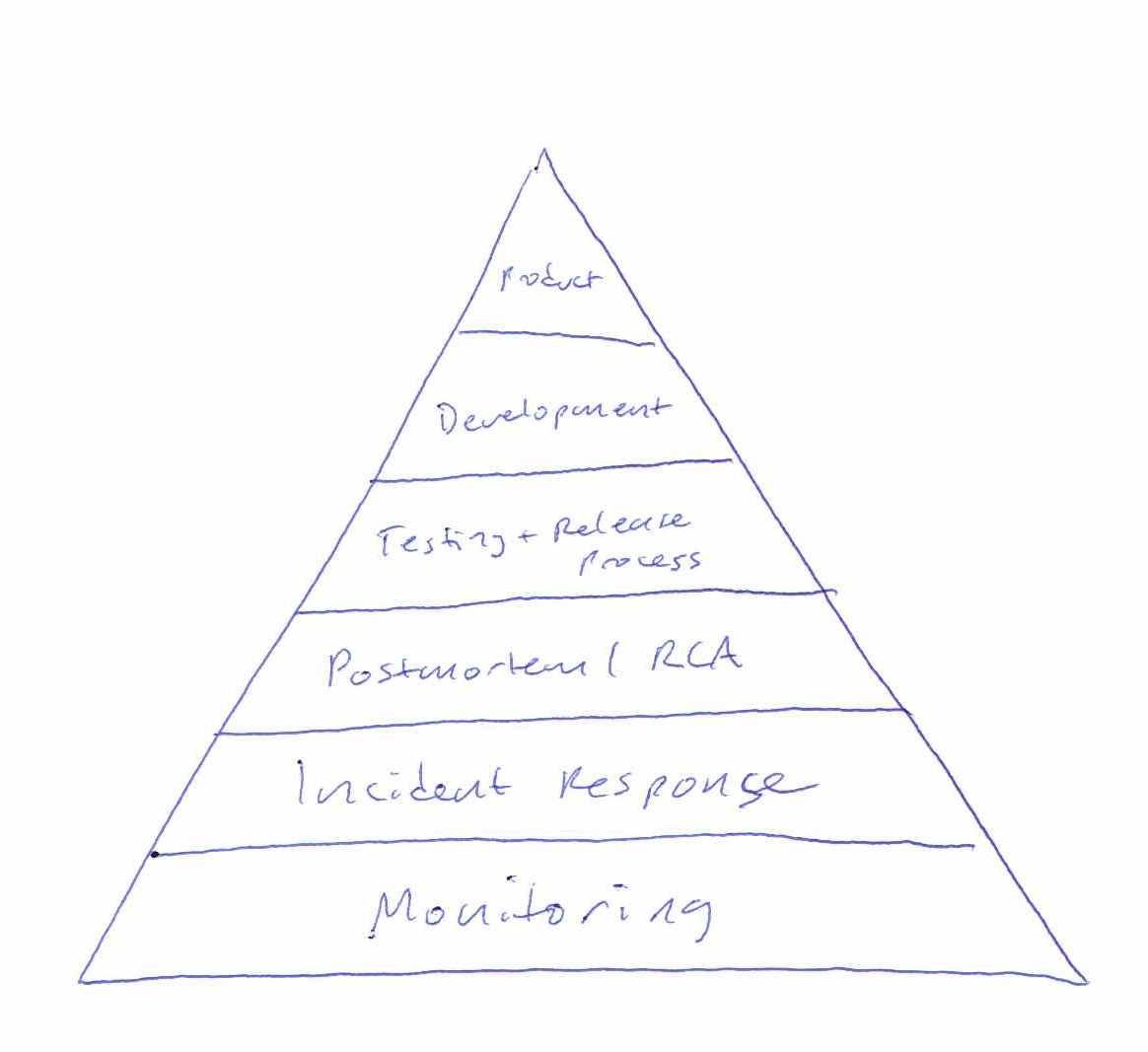
Without a foundation of monitoring or incident response, it was impossible to know that Healthcare.gov worked. The policy intent was not being delivered. The individual components were all being individually monitored by the contractors responsible for them, but little effort was spent securing predictability by enforcing coordination so that outages could have an agreed-upon boundary. Without the platform of common language about the system, the pyramid is just a tower of babel.
Faced with these same challenges, the private sector often simply folds (pivots). Phil Gyford runs a cherished record of tone-deaf service shutdowns called Our Incredible Journey. Markets get resegmented, teams sell themselves to bigger companies, and engagement gets prioritized over service delivery. However, public servants don’t pivot.
Returning to the topic of the Accelerating Smart Cities and Making Data Meaningful events, “smart” and “meaningful” can only be used in retrospect as a judgement of success. A city government is mandated to meet certain needs of its residents. Having met those needs is the only way in which it can be said to be smart. Urban informatics dashboards, mass data collection, and coordinated networks of magic talking light poles are not user needs. Having been available, current, and usable is the only way in which data can be said to be meaningful (to borrow from Renee Sieber’s definition of open data). Having supported novel uses by other people is the only way in which a government can be said to be a platform.
subscribe to ![]() this site.
|
contact Michal Migurski
this site.
|
contact Michal Migurski