tecznotes
Michal Migurski's notebook, listening post, and soapbox. Subscribe to ![]() this blog.
Check out the rest of my site as well.
this blog.
Check out the rest of my site as well.
Mar 20, 2017 6:57pm
district plans by the hundredweight
For the past month, I’ve been researching legislative redistricting to see if there’s a way to apply what I know of geography and software. With a number of interesting changes happening including Wisconsin’s legal battle, Nicholas Stephanopoulos and Eric McGhee’s new Efficiency Gap metric for partisan gerrymandering, and Eric Holder’s new National Democratic Redistricting Committee (NDRC), good things are happening despite the surreal political climate in the U.S.
My stopping point last time was the need for better data. We need detailed precinct-level election results and geographic boundaries for all 50 states across a range of recent elections, and lately the web has been delivering on this in spades.
My former Stamen and Mapzen colleague Nathaniel Vaughn Kelso created a new home on Github for geographic data, and the collection has grown swiftly. In our research, we also found this excellent overlapping collection from Aaron Strauss and got in touch. This is a current render showing overall data coverage and recency (darker green states have data from more recent elections):
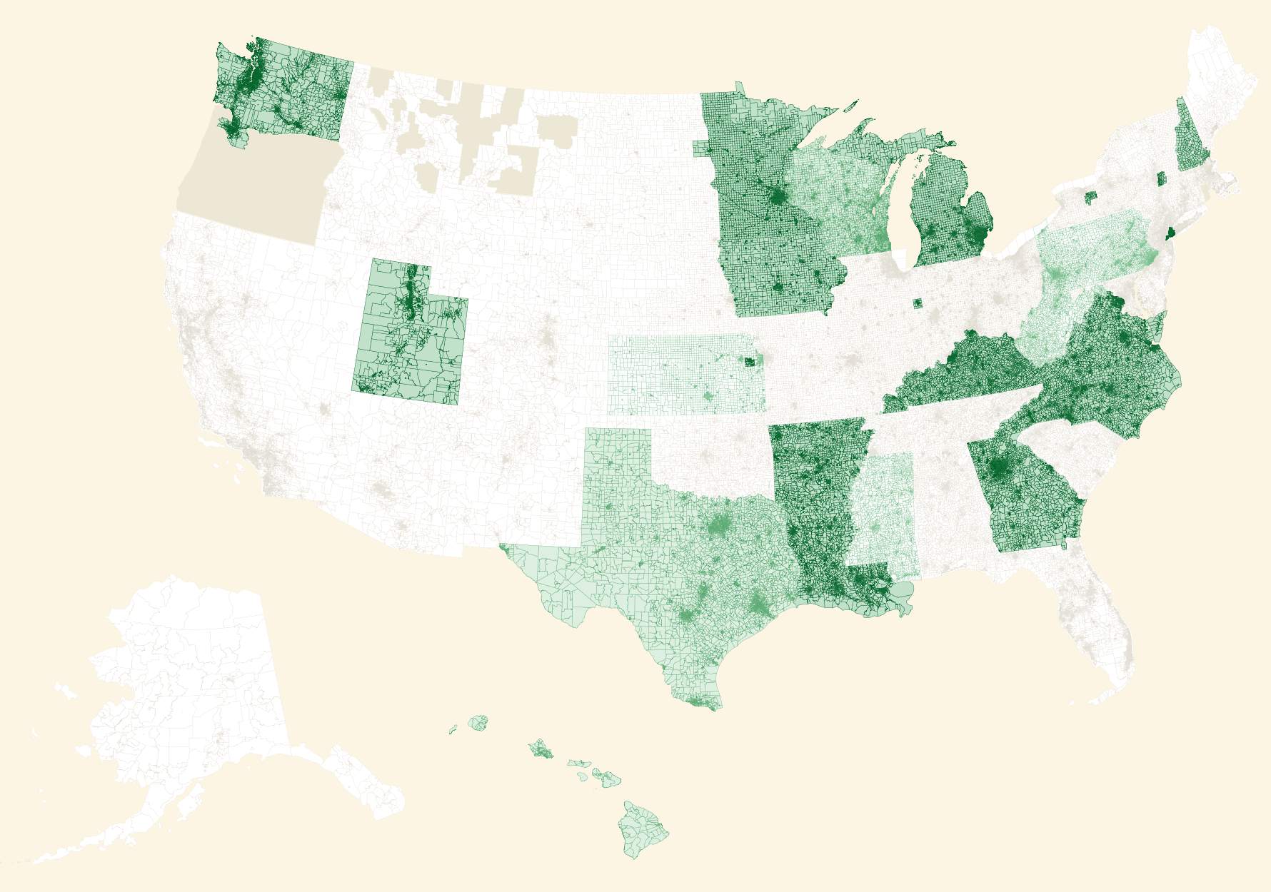
If you want to help, browse the issues in the repo to find data that needs collecting.
Meanwhile, the annual NICAR conference for digital journalism brought a renewed call for participation from the Open Elections project. Project cofounder Derek Willis particularly calls out these areas in need of data entry:
North Carolina and Virginia are two important states with electronic data on the way, and volunteers are working on Wisconsin. Try some of the links above to find data entry tasks for Open Elections.
So, the volume and quality of data required for accurate measurement of partisan gerrymandering has been growing. Previously, I’ve been using detailed California data to experiment as described in my previous post a couple weeks ago. Wisconsin is a particularly high-profile state in this area, and we happen to have great 2014 general election precinct level data in the repositories above.
Wisconsin
This week, I’ve switched my focus to Wisconsin and experimented with a bulk, randomized approach. Borrowing from Neil Freeman’s Random States Of America idea and Professor Jowei Chen’s randomized Florida redistricting paper, I generated hundreds of thousands of district plans based on counties and census tracts and attempted to measure their partisan efficiency gap for U.S. House votes.
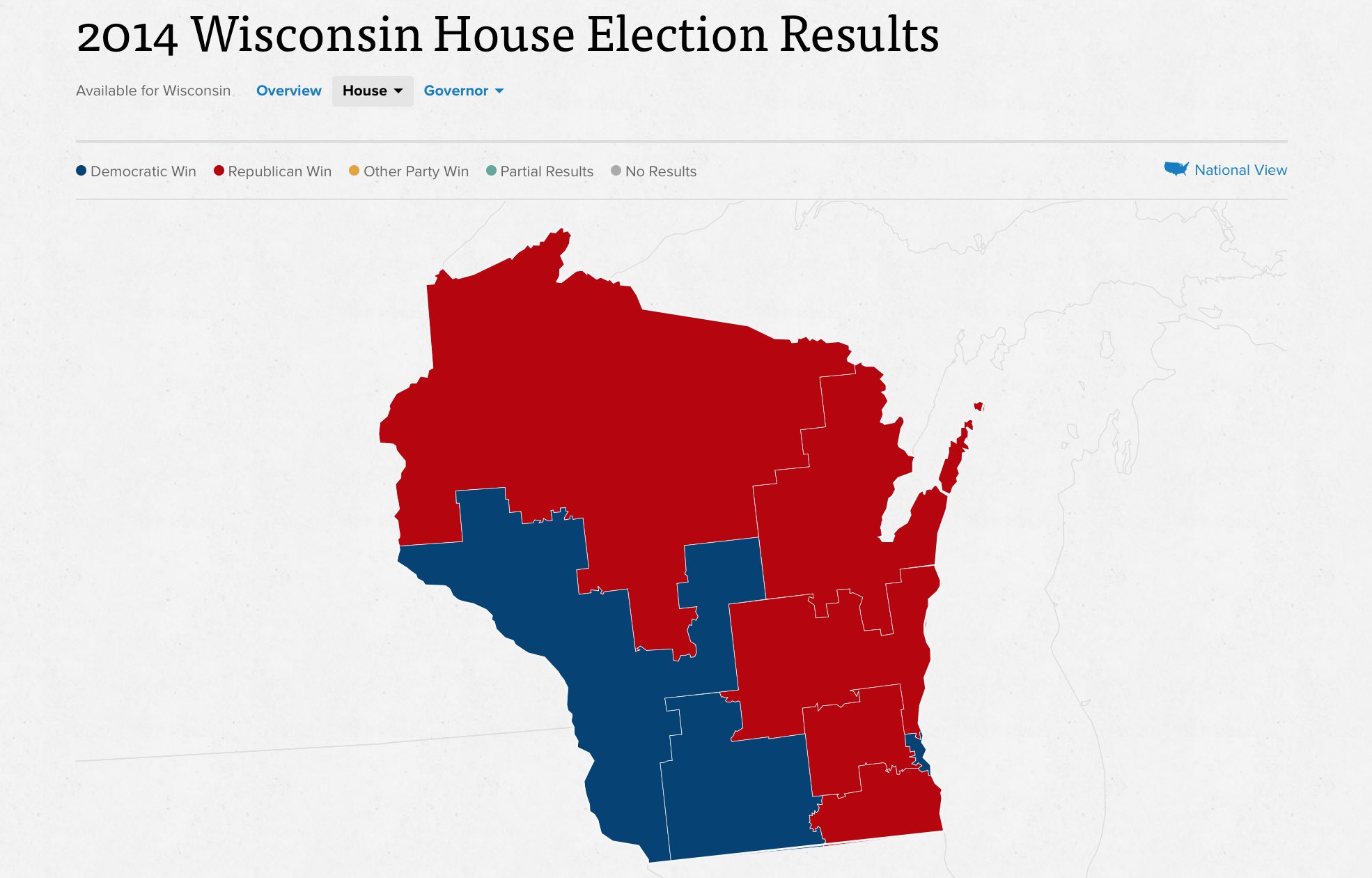
Wisconsin’s 2014 general election resulted in five Republican congressional seats and three Democratic ones, with 1,228,145 votes cast for Republicans and 1,100,209 votes cast for Democrats. There are just eight Congressional districts in Wisconsin, and all candidates in 2014 ran with a major-party opponent. Unopposed races present a special challenge for efficiency gap calculations, and I’m happy to have skipped that here. This is a results map from Politico:
My process is coarse and unsophisticated, but it adequately demonstrates the use of randomization and selection for both counties and tracts. Random plans make it possible to rapidly generate a very wide set of possibilities and navigate among them, selecting for desired characteristics. Code is here on Github.
This is a progress report. Some caveats:
- All random plans produce valid contiguous districts, because of the graph-traversal method I’m using.
- Most random plans don’t produce equally-populated districts, because I have not yet taken this into account when building plans. I’m experimenting with selecting valid plans from a larger universe.
- Most random plans produce Republican-weighted efficiency gaps, because liberal voters tend to cluster geographically in cities and towns.
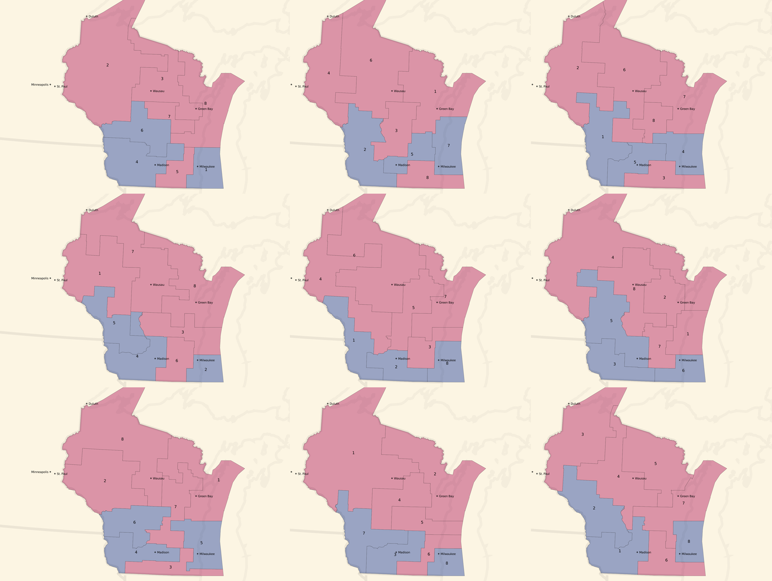
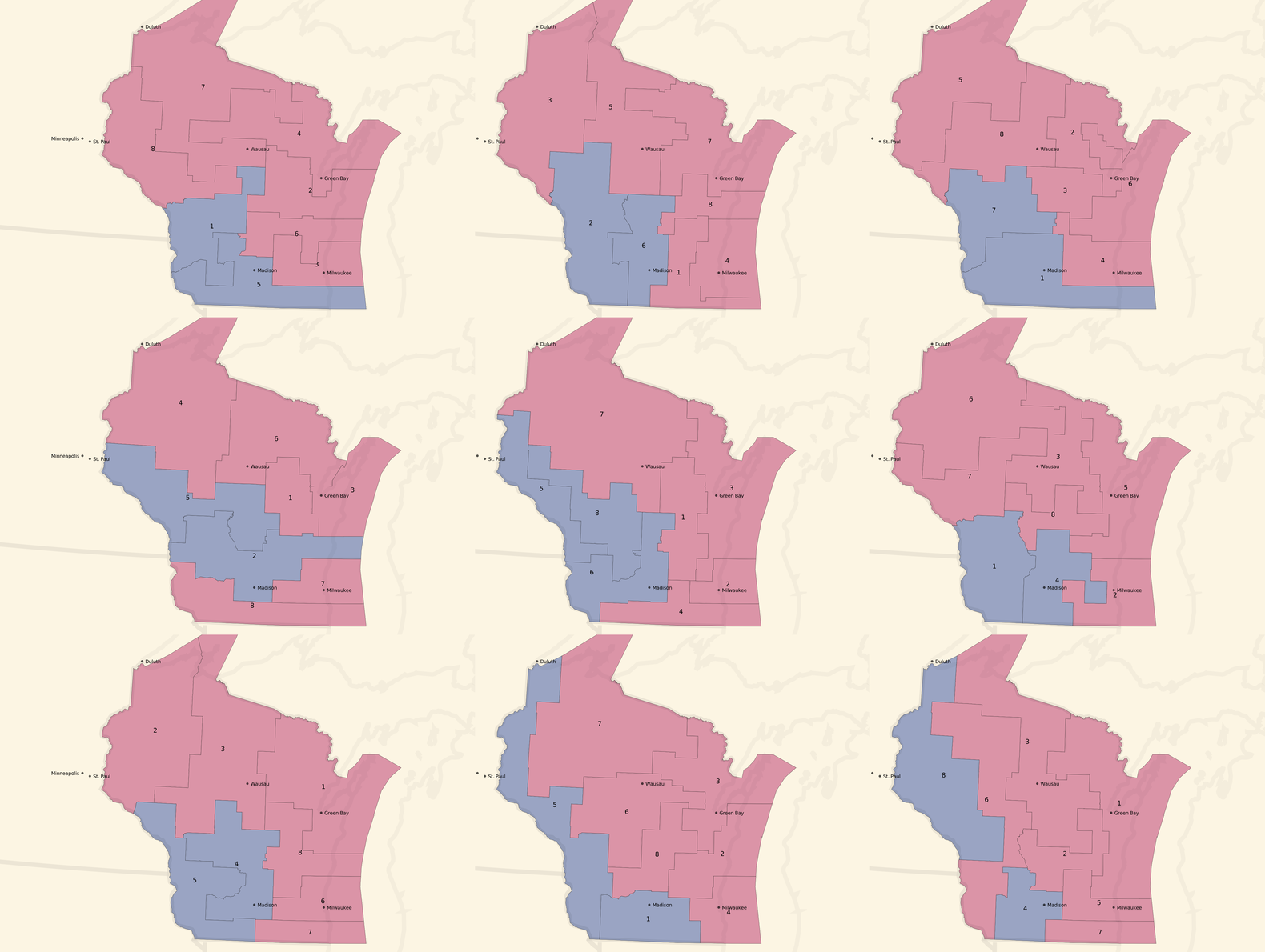
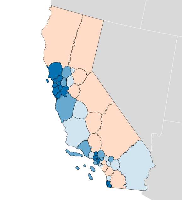
Here are some partisan-balanced county-based plans:
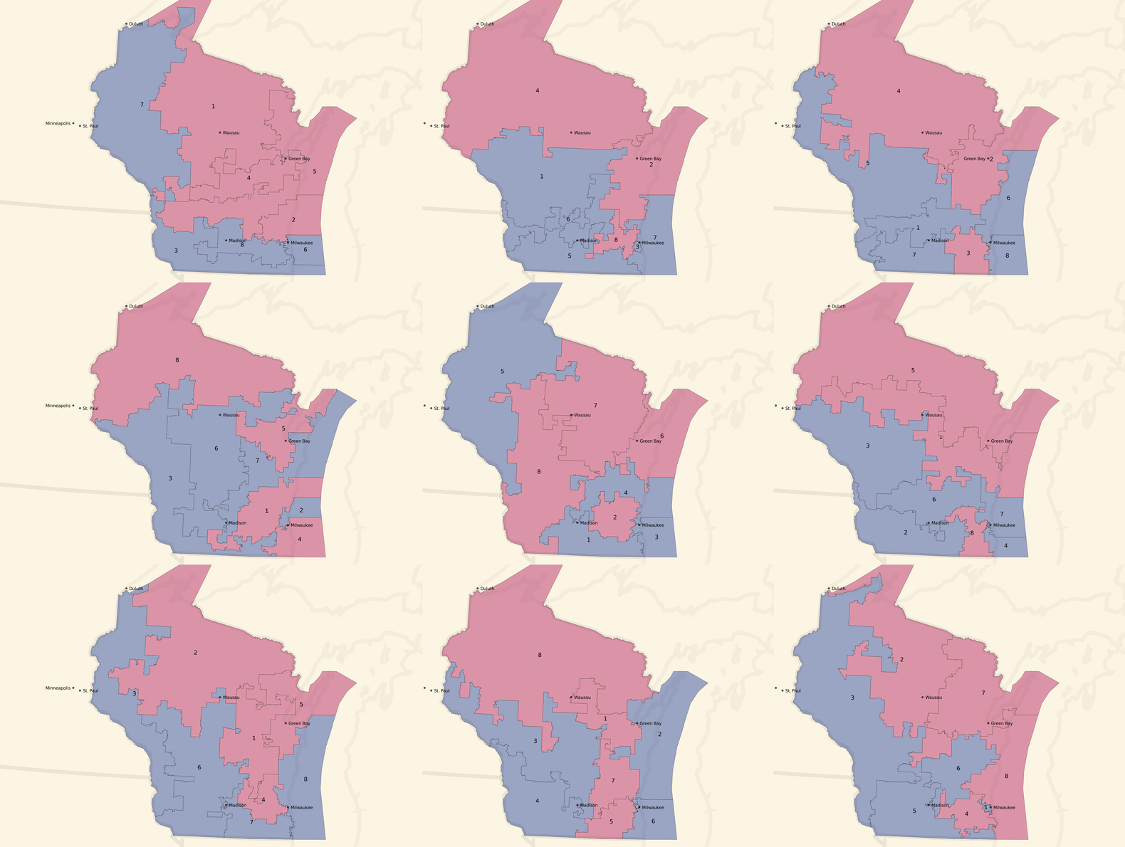
And here are some partisan-balanced tract-based plans:
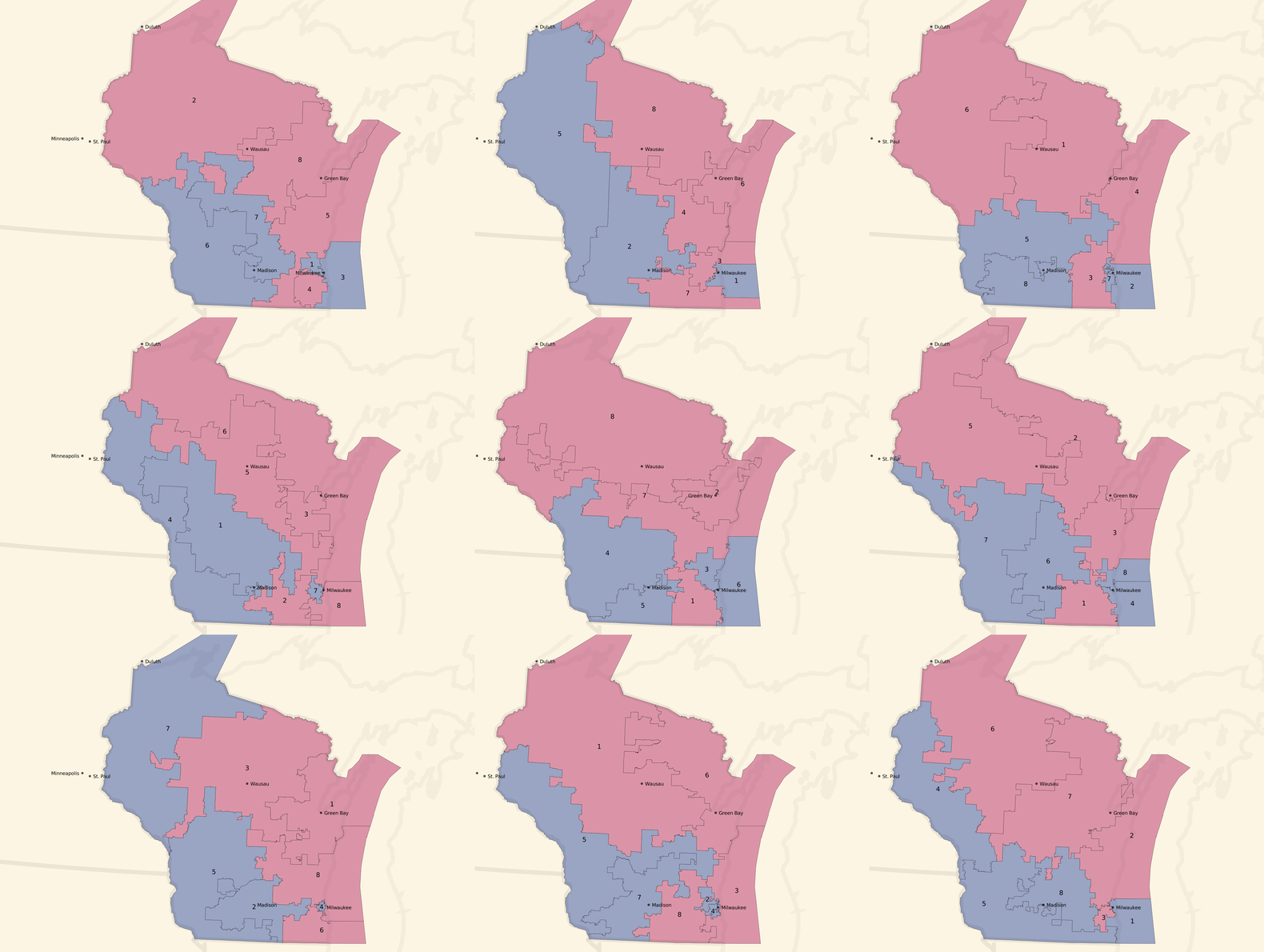
The plans are all random, but a few common features jump out immediately:
- Milwaukee and Madison are both strongly Democratic cities, and come up blue in all randomized sample plans.
- The southwest of the state also tilts Democratic, and comes up blue in all randomized sample plans.
- The resulting seat balances hovers between 5 Republican / 3 Democratic and an even 4/4 split, which generally reflects the slim 5% Republican statewide vote advantage.
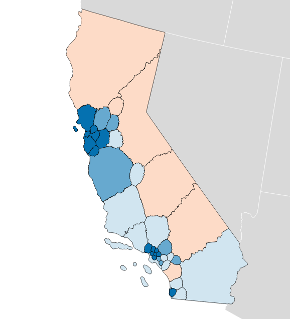
We can turn the dial to the right, and look at some unbalanced, pro-Republican county-based plans:
Unbalanced, pro-Republican tract-based plans:
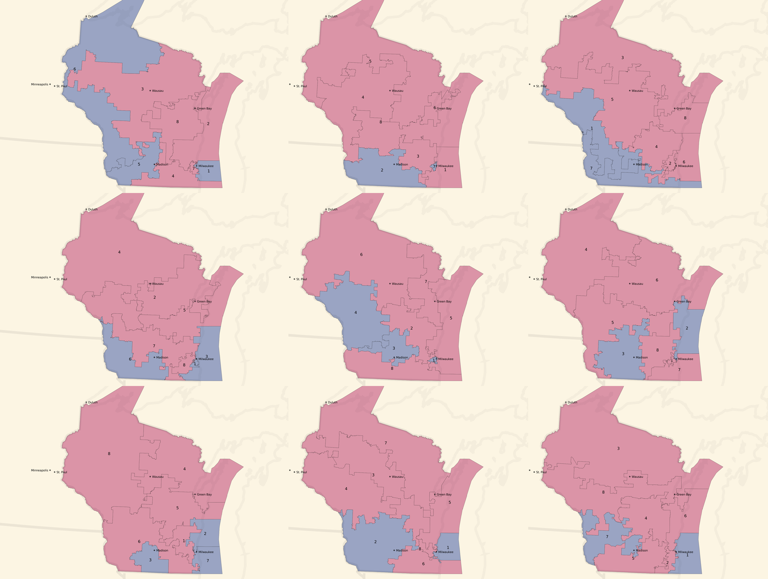
Most of these unbalanced plans show a seat balance that shifts closer to 6 Republican / 2 Democratic seats, and the blue around Milwaukee and in western Wisconsin is often erased.
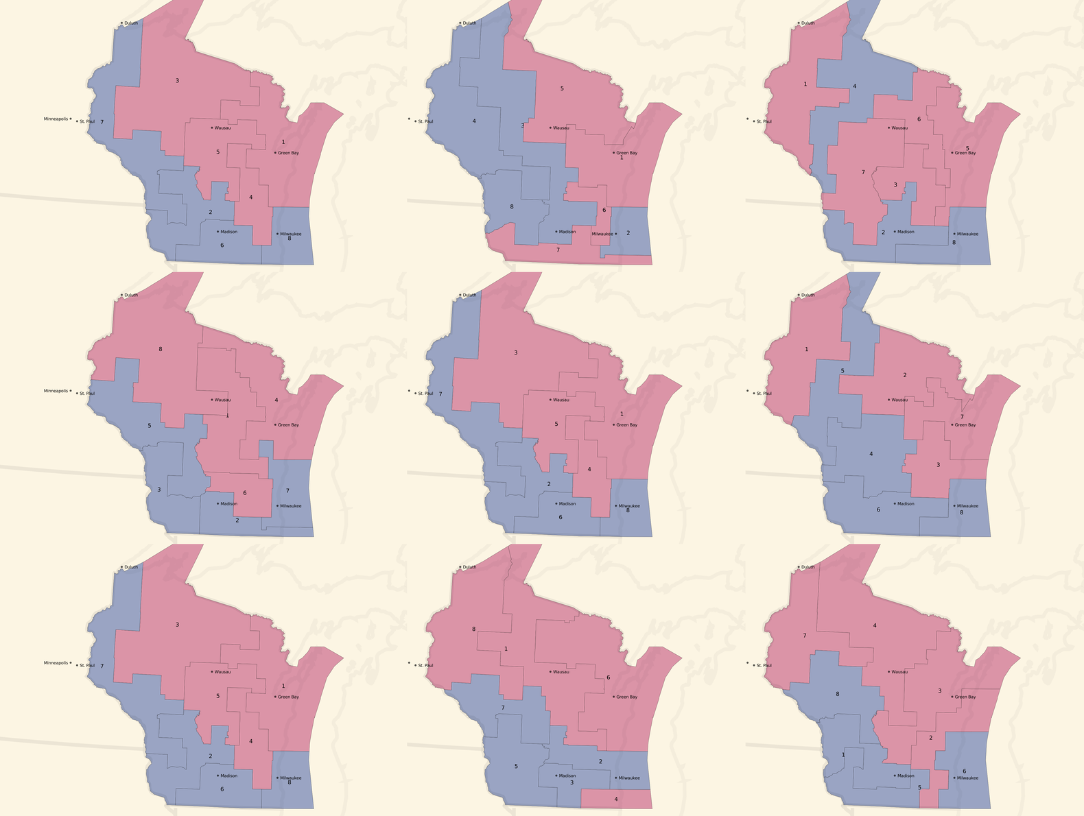
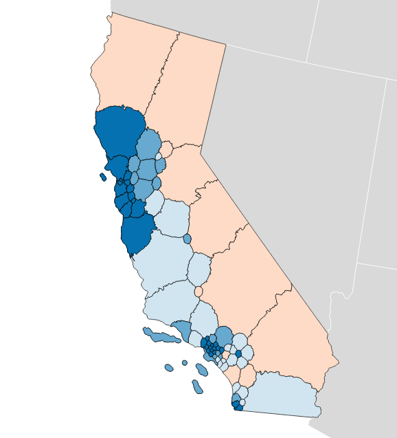
Or, we can turn the dial to the left, and look at some unbalanced, pro-Democratic county-based plans:
Unbalanced, pro-Democratic tract-based plans:
These are less dramatic, but you can see a few instances of 5 Democratic / 3 Republican seat advantages and a lot more 4/4 balances. The original geographic distribution remains, but the blue areas creep northwards.
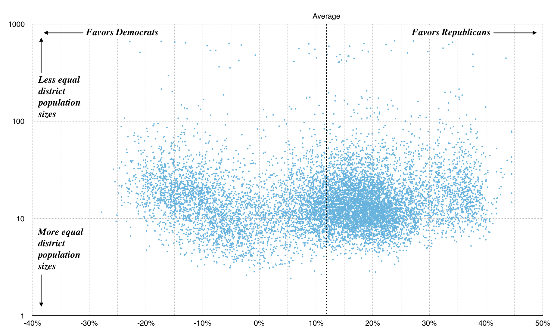
We can zoom out a bit, and look at scatterplots of the county and tract approaches instead of maps. These plots show left/right efficiency gap plotted on the x-axis, and population gap (ratio between highest-population and lowest-population district) on the y-axis. Right away, the first graph shows us some limitations of building district plans from counties: it’s hard to get the necessary population balance required for a legal district, and many randomized plans result in lopsided population distributions. All of the sample plans illustrated above have been pulled from the bottom edge of this graph:
Graph made with Nathaniel Vaughn Kelso
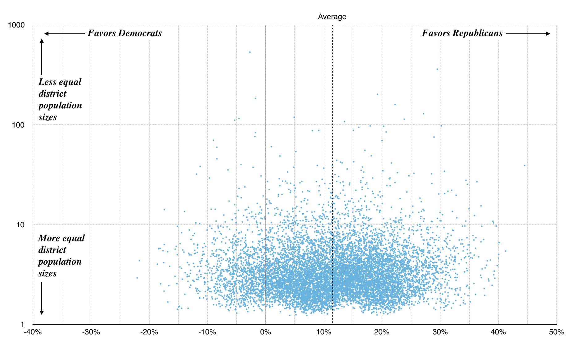
Because U.S. Census tracts are population-weighted, the tract-based plans fare a bit better with many more showing up near 1.0:
Graph made with Nathaniel Vaughn Kelso
The average efficiency gap for both county and tract plans is around 12%. This is outside McGhee and Stephanopoulos’s suggested 8% cutoff. In other words, in drawing random districts you are more likely to accidentally gerrymander Big Sort urban liberals out of power than the reverse because they are more geographically concentrated.
If you’re interested in checking out some of the district plans I’m generating and selecting from, I’ve provided downloadable data here, with one JSON object per plan per line in a pair of big files using Census GEOIDs for counties and tracts:
Next Steps
- With a way to generate a population of random candidates, run an optimizer to find the “best” candidate for the criteria we want: hill climbing, genetic algorithms, etc. The key here is to define a score for a plan that incorporates several factors: population and partisan balance, demographics, etc.
- Knowing that random plans can lead to big population imbalances, improve the plan generator to make equal-population plans more likely. Population gaps are a baseline requirement for a valid plan, so waste less time generating and evaluating these.
- Look at state legislative results. How many candidates ran unopposed? Can we generate similar plans for Wisconsin’s 33-seat Senate and 99-seat Assembly?
Thanks to Nelson, Zan, and Nathaniel for feedback on early versions of this post.
Mar 4, 2017 6:32pm
baby steps towards measuring the efficiency gap
In my last post, I collected some of what I’ve learned about redistricting. There are three big things happening right now:
- Wisconsin is in court trying to defend its legislative plan, which is being challenged on explicitly partisan grounds. That’s rare and new, and Wisconsin is not doing well.
- A new metric for partisan gerrymandering, the Efficiency Gap, is providing a court-friendly measure of partisan effects.
- Former U.S. Attorney General Eric Holder is building a targeted, state-by-state strategy for Democrats to produce fairer maps in the 2021 redistricting process.
Use this map to find out what three districts you’re in.
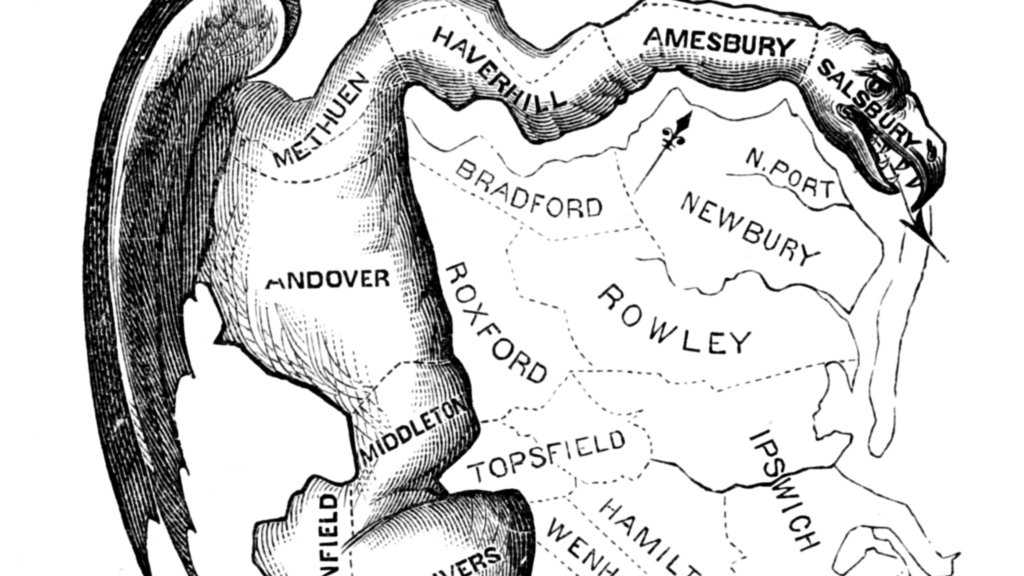
Gerrymandering is usually considered in three ways: geographic compactness to ensure that constituents with similar interests vote together, racial makeup to comply with laws like the Voting Rights Act, and partisan distribution to balance the interests of competing political parties. The original term comes from a cartoon referencing a contorted 1812 district plan in Massachusetts:
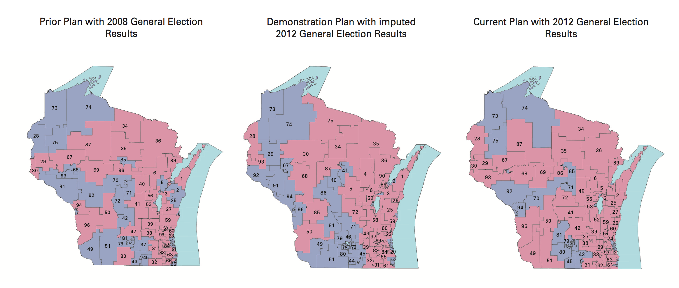
Since publishing that post, I’ve been in touch with interesting people. A few shared this article about Tufts professor Moon Duchin and her Tufts University class on redistricting. Looks like I just missed a redistricting reform conference in Raleigh, well covered on Twitter by Fair Districts PA. Bill Whitford, the plaintiff in the Wisconsin case, sent me a collection of documents from the case. I was struck by how arbitrary these district plans in Exhibit 1 looked:
Combined with Jowei Chen’s simulation approach, my overall impression is that the arbitrariness of districts combined with the ease of calculating measures like the efficiency gap make this a basically intentional activity. There is not an underlying ideal district plan to be discovered. Alternatives can be rapidly generated, tested, and deployed with a specific outcome in mind. With approaches built on simple code and detailed databases, district plans can be designed to counteract Republican overreach. There’s no reason for fatalism about the chosen compactness of liberal towns.
I’m interested in partisan outcomes, so I’ve been researching how to calculate the efficiency gap. It’s very easy, but heavily dependent on input data. I have some preliminary results which mostly raise a bunch of new questions.
Some Maps
The “gap” itself refers to relative levels of vote waste on either side of a partisan divide, and is equal to “the difference between the parties’ respective wasted votes in an election, divided by the total number of votes cast.” It’s simple arithmetic, and I have an implementation in Python. If you apply the metric to district plans like Brian Olson’s 2010 geographic redistricting experiment, you can see the results. These maps show direction and magnitude of votes using the customary Democrat blue and Republican red, with darker colors for bigger victories.
Olson’s U.S. House efficiency gap favors Democrats by 2.0%:
Olson’s State Senate efficiency gap favors Democrats by a whopping 9.7%:
Olson’s State Assembly efficiency gap also favors Democrats by 9.8%:
So that’s interesting. The current California U.S. House efficiency gap shows a mild 0.3% Republican advantage. Olson’s plans offer a big, unfair edge to Democrats, though they have other advantages such as compactness.
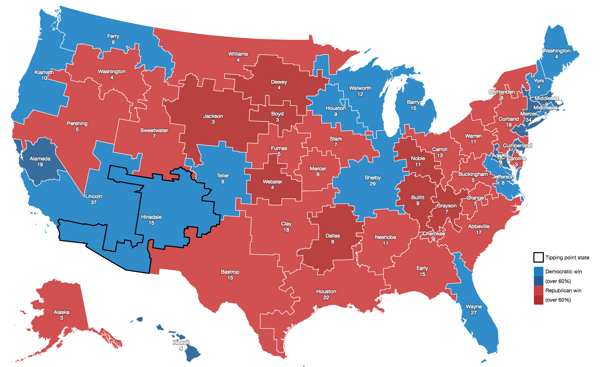
You can measure any possible district plan in this way: hexbins, Voronoi polygons, or completely randomized Neil Freeman shapes. Here’s a fake district plan built just from counties:
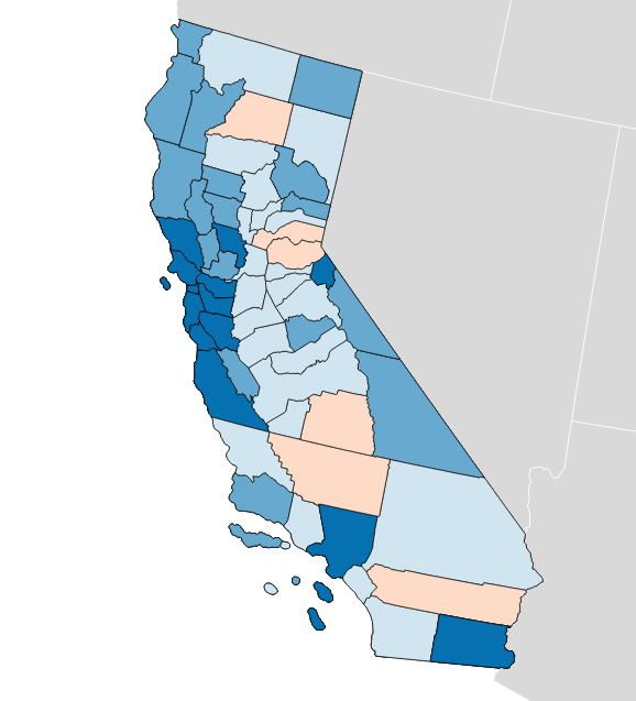
This one shows a crushing +15.0% gap for Democrats and a 52 to 6 seat advantage. This plan wouldn’t be legal due to the population imbalance between counties.
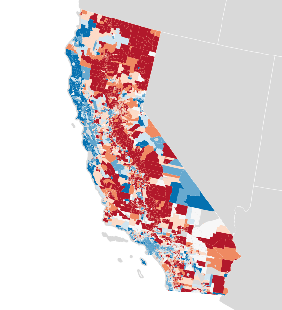
Each of these maps shows a simple outcome for partisan votes as required for the efficiency gap measure. Where do those votes come from? Jon Schleuss, Joe Fox, and others at the LA Times on Ben Welsh’s data desk created a precinct-level map of California’s 2016 election results, so I’m using their numbers. They provide two needed ingredients, vote totals and geographic shapes for each of California’s 26,044 voting precincts. Here’s what it looks like:
When these precincts are resampled into larger districts using my resampling script, vote counts are distributed to overlapping districts using a simple spatial join. I applied this process to the current U.S. House districts in California, to see if I got the same result.
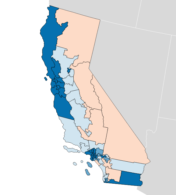
There turns out to be quite a difference between this and the true U.S. House delegation. In this prediction from LA Times data the seat split is 48/8 instead of the true 38/14, and the efficiency gap is 8.6% in favor of Democrats instead of the more real 0.3% in favor of Republicans. What’s going on?
Making Up Numbers
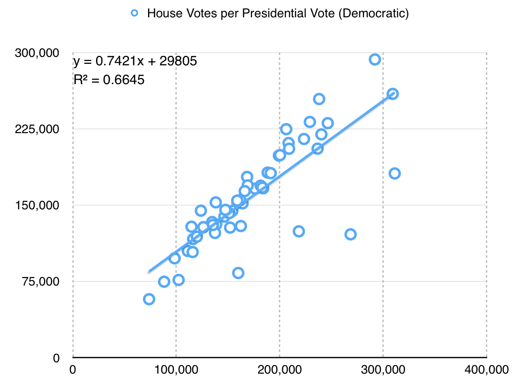
The LA Times data includes statewide votes only: propositions, the U.S. Senate race, and the Clinton/Trump presidential election. There are no votes for U.S. House, State Senate or Assembly included. I’m using presidential votes as a proxy. This is a big assumption with a lot of problems. For example, the ratio between actual U.S. House votes for Democrats and presidential votes for Hillary Clinton is only about 3:4, which might indicate a lower level of enthusiasm for local Democrats compared to a national race:
The particular values here aren’t hugely significant, but it’s important to know that I’m doing a bunch of massaging in order to get a meaningful map. Eric McGhee warned me that it would be necessary to impute missing values for uncontested races, and that it’s a fiddly process easy to get wrong. Here, I’m not even looking at the real votes for state houses — the data is not conveniently available, and I’m taking a lot of shortcuts just to write this post.
The Republican adjustment is slightly different:
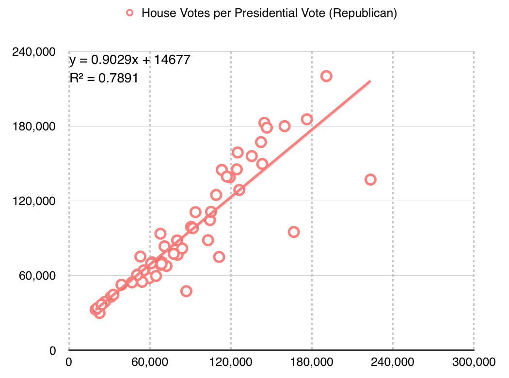
They are more loyal voters, I guess?
Availability of data at this level of detail is quite spotty. Imputing from readily-available presidential data leads to misleading results.
Better Data
These simple experiments open up a number of doors for new work.
First, the LA Times data includes only California. Data for the remaining states would need to be collected, and it’s quite a tedious task to do so. Secretaries of State publish data in a variety of formats, from HTML tables to Excel spreadsheets and PDF files. I’m sure some of it would need to be transcribed from printed forms. Two journalists, Serdar Tumgoren and Derek Willis, created Open Elections, a website and Github project for collecting detailed election results. The project is dormant compared to a couple years ago, but it looks like a good and obvious place to search for and collect new nationwide data.
Second, most data repositories like the LA Times data and Open Elections prioritize statewide results. Results for local elections like state houses are harder to come by but critical for redistricting work because those local legislatures draw the rest of the districts. Expanding on this type of data would be a legitimate slog, and I only expect that it would be done by interested people in each state. Priority states might include the ones with the most heavily Republican-leaning gaps: Wyoming, Wisconsin, Oklahoma, Virginia, Florida, Michigan, Ohio, North Carolina, Kansas, Idaho, Montana, and Indiana are called out in the original paper.
Third, spatial data for precincts is a pain to come by. I did some work with this data in 2012, and found that the Voting Information Project published some of the best precinct-level descriptions as address lists and ranges. This is correct, but spatially incomplete. Anthea Watson Strong helped me understand how to work with this data and how to use it to generate geospatial data. With a bit of work, it’s possible to connect this data to U.S. Census TIGER shapefiles as I did a few years ago:
This was difficult, but doable at the time with a week of effort.
Conclusion
My hope is to continue this work with improved data, to support rapid generation and testing of district plans in cases like the one in Wisconsin. If your name is Eric Holder and you’re reading this, get in touch! Makes “call me” gesture with right hand.
Code and some data used in this post are available on Github. Vote totals I derived from the LA Times project and prepared are in this shapefile. Nelson Minar helped me think through the process.
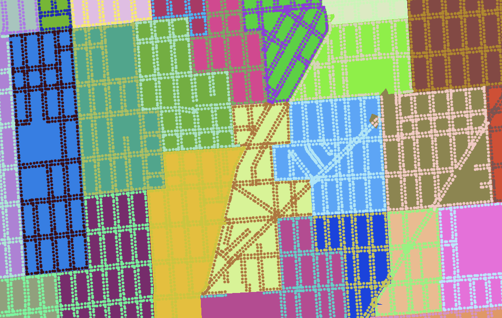
In closing, here are some fake states from Neil Freeman:
subscribe to ![]() this site.
|
contact Michal Migurski
this site.
|
contact Michal Migurski