tecznotes
Michal Migurski's notebook, listening post, and soapbox. Subscribe to ![]() this blog.
Check out the rest of my site as well.
this blog.
Check out the rest of my site as well.
Jun 29, 2009 5:56am
we are all screen readers now
In 1998, the Web Standards Project (WaSP) opened its doors with the rallying cry "to hell with bad browsers". Their goal was support for W3C web standards with the aim of preventing development costs from skyrocketing as the major browser makers of the time (Netscape and Microsoft) split the public with two diverging products.
One of the core arguments made by standards advocates focused on accessibility requirements, in particular the design of web pages that were available to blind users with screen reader software. Use semantic markup in place of layout tables, single-pixel image shims and GIF text, and what you write will be readable by everyone. I remember making this argument at the web design company I worked out fresh out of college, and it was always a bit of a hard sell even to myself. I didn't quite believe in the legions of blind users out in the world struggling to access my rave flyer portfolio through Jaws, and after a while it all took on a sense of righteousness-for-its-own sake, purity in the face of ugly real-world commercial requirements.

Fast-forward ten years, and I'm now using all those accessibility features on a daily basis. At some point during the dot-com bust it turned out that the written word was the payload, and regular people started using alternative browsing devices to access text from the web. Arguments about device-independent, semantic markup and graceful degradation suddenly have an additional halo of legitimacy because they affect everyone.
I recently bought a Kindle, and I'm again thankful for the past decade's vogue for separation of style and content. I'm pleasantly surprised by the dissolution of technology into behavior, with my "read later" Instapaper bookmarklet that time- and space-shifts all the usual tl;dr's into BART-compatible slugs of pure text on a reflective screen. Meanwhile Arc90 Lab has produced Readability, the browser bookmarklet designed to suss out usable signal from "all the insanity that surrounds the content we're trying to read". All those years of making half-hearted arguments for disabled visitors are paying off in usable content for everyone else. I read more now, and more effectively. Talented web designers are arguing for the abandonment of old technology that shackles content to form.
The web is the best thing that ever happened to reading.
There's one area that's lagging, and it's PDF. I love reading academic papers, but they're generally set in a two column skeuomorph form that's hell on Amazon's PDF-to-Kindle conversion feature. The text comes out interleaved, with a line from the left column followed by a line from the right column, repeat. Amazon does OCR on bitmapped PDF's, but they can't yet figure out this dinosaur format.

I'm looking forward to the day I can bundle everything off to Instapaper and the Kindle for later digestion. I'd love to see this last print-dependent content form liberated from uselessness.
Jun 25, 2009 9:04am
fever again
I mentioned a few things last week I thought were interesting about Fever, Shaun Inman's new web-based feed reading tool. Feed readers as a technology have basically remained stationary for a number of years, so I'm excited by the idea that someone is rethinking them in some way. This is a set of hastily-written notes based on my experience with Fever.
I'm a little harsh on the application in places, so it's worth mentioning that I think Shaun Inman has made a beautiful thing, and apart from the gripes listed here, I'd probably recommend Fever to anyone who's looking for a basic feed reader and wants to avoid being tethered to a single desktop or remote service provider.
First, my bias: four years ago, Mike Frumin, Boris Anthony and I were working hard on Reblog, the Eyebeam-supported tool for reading and republishing RSS feeds. Eyebeam used it to curate feeds about art and technology, with weekly stints by guest Rebloggers using software initially created by Frumin. I'm told that Tumblr's Reblog feature was explicitly influenced by our Reblog. Even though ours is for all intents and purposes a dead project, I continue to use it every day as my primary reading and republishing mechanism.
I'm interested in Fever because I'd be happy to move away from Reblog if the right tool came along, and the core promise of Fever, to show you what's most highly attended-to in your collection of feeds, is a pretty exciting one, like a personal Memeorandum or Digg.
I went ahead and bought a copy of Fever to give it a test run. It's server side software, and there doesn't seem to be anything like a demo mode. You need to cough up $30 to see what it's like. Now that I've tried it out, I have some additional things to say about this software in particular and web interaction patterns in general.
Install
The installation process is a breeze, and extremely innovative to boot. There are three steps: you start with a small seed application on your own server, you make it world-writeable so that it can modify itself, and then you link it to a paid account on the Fever website. The complete application is pushed to your server without your intervention, and you're off to the races. I'm fairly certain I've never seen anything quite like this before: usually PHP/MySQL software is more like Reblog or Wordpress, where you unpack the thing as a complete unit, install the database and so on yourself, and do your own configuration. Fever seems to have some basic protections in-place to prevent malicious outsiders from scrambling your installation, but there's a completely fascinating power inversion at play. Where the entertainment and software industries have spent millions or more trying to develop bulletproof phone-home mechanisms to ensure that your local copies of their media refuse to play without remote authorization, Fever takes advantage of its naturally web-facing nature to establish a link back to its home base. Because Fever doesn't ask you to change the folder permissions back from world-writeable, I was curious whether Inman would use this as a vector for remote software upgrades.
I saw this just the other day:
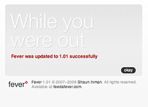
Just now I saw a second one, for version 1.02. The messaging here is astonishing: while you were out, something you own transformed itself into something new.
Overall though, installation was a breeze: it took a few minutes (including some wrangling with the always-execrable PayPal) to get set up.
There are two aspects of Fever's design that I'm not altogether happy with.
Hover
The first is hover controls, described by Smashing Magazine:
When a user interface has many elements in which the user can perform actions, the page can become cluttered and hard to scan. This is especially common in the administration section of Web applications, where users can change table data. A good way to handle this is to hide each element and reveal it when the user hovers over that area.
Fever uses this technique to a frustrating degree, shown in this animation of me moving the mouse from the left side of the browser to the right:
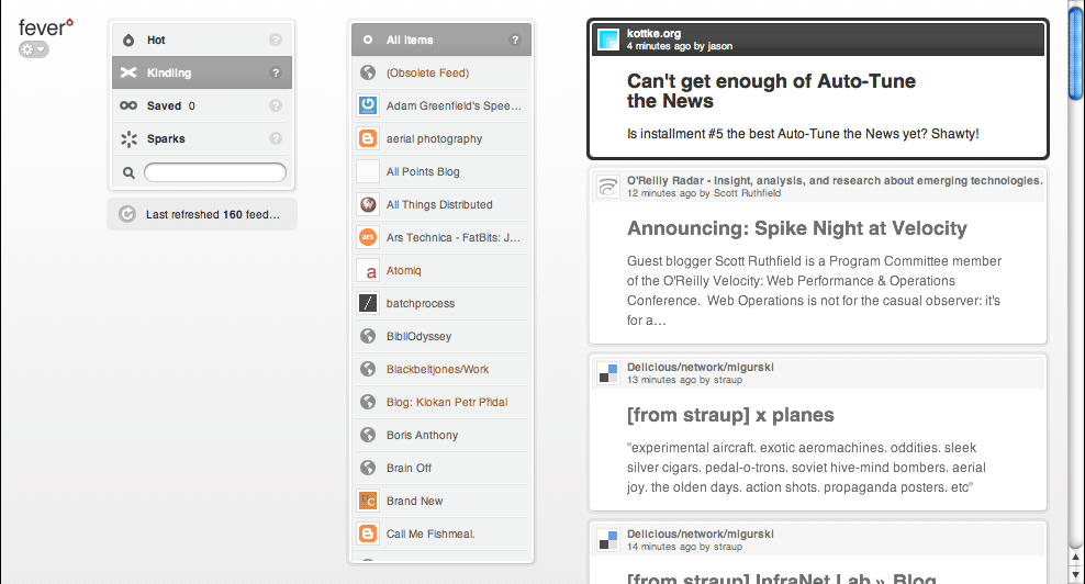
Whole swaths of functionality hide and show themselves, including various management controls, an iPhone-style alphabetical navigation column, and highlighting of feed items on the right hand side. Personally, I think this is a particularly terrible form of mystery meat navigation. It's difficult to discover what actions are available to you in an application if you need to fly around the screen with your mouse to look for controls, and the particular design of Fever doesn't let the hover controls save any particular space or clutter. Commenter James Schend on the article linked above describes a second way in which this pattern is harmful: Beware, hover controls only work on devices that have a mouse. They're useless on iPhones. (And tablet PCs, and touchscreen kiosks, etc, etc.)
Overall, the high amount of mouse-reactive interface mutability in Fever makes it feel shaky, jittery and tentative. There are places where it doesn't even help, e.g. what the fuck is this?
This idea of subjective perception of physical stability in interactive software is something I think is particularly hard to get right, but enormously important - Apple's work in particular seems to absolutely nail this every time, through the acceleration models in their basic widgetry, particularly on the iPhone and trackpad.
My recommendation here would be to simply turn all this stuff off, and leave all the UI elements on-screen and unresponsive to simple mouse movements. 99% of desktop UI conventions simply don't make sense on the web (I'm looking at you, drag and drop).
Distance
The second aspect of Fever's design that I'm not altogether happy with is spooky action at a distance. By this I mean pieces of the page that influence other pieces of the page without apparent reason.
Fever uses the now-common AJAX technique to perform updates, allowing users to delete articles and modify feed subscriptions within list views. The frustrating thing about Fever's implementation of this technique is that it visually centralizes the wait indicator: you perform an action such as deleting an article on the right-hand side of the browser window, a wait spinner appears on the left-hand side of the window, time passes, and finally the visual result of your action modifies the appearance of the page. Your single action has effects in two places and two times, and your attention is split.
To be fair, Fever is not the only offender here. For a long time, Twitter used this same pattern when posting updates from inside the web interface, with a tiny spinner tucked up and away in the corner of the screen, far away from the text and button form elements you used to make your update. They've since mended this particular problem (while simultaneously introducing some really ill-advised link-breaking AJAX-based page replacement navigation).
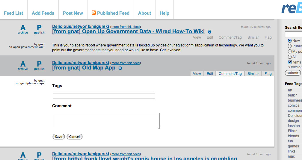
When you perform "bigger" actions, Fever uses a modal dialog box to ask for confirmation, something I've always called The Ghetto Shield because it's so lame. Here's me trying to add an item to a blacklist:
This is another desktop UI convention that has no place on the web. Even Apple left this in the dustbin of history when it replaced system-blocking dialogs with per-window sheets with the introduction of OSX.
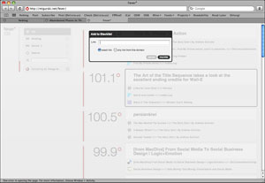
My recommendation here would be to take advantage of AJAX and HTML's ability to localize action and reaction: changes should take place where and when you made them, even if their confirmation takes time. This is something that I continue to believe we got absolutely right with Reblog back in 2005. As an example, here's the bit of interface Reblog provides for adding tags or comments to an article prior to republishing it:
The form replaces the content of the item (it's invoked by the small tabs to the right), so that you can have as many forms as you have items. No modal dialog, just an asynchronous modification in place. We also handle the split attention issue here by placing loading spinners near their associated actions. In this example, you'd publish the article by clicking the big letter "P" next to its title, which would be replaced by a spinner for a second or two until the action returns successfully. If you were to archive the article (mark it as read), the content immediately disappears leaving just a collapsed title bar area to indicate that you want it gone, the "A" is replaced by a spinner, and soon it's visually labeled "archived". Crucially, this allows you to immediately shift your attention to the next article in the list, knowing that there will be no further motion of on-screen elements to further distract you. Fever by contrast doesn't remove the article from the screen until after the server has confirmed that it's gone, making it necessary to hang around waiting for your action to have an effect before you can safely move to the next article.
Temperature
I've not said much about the core feature of Fever, its ability to dig through your articles and "take the temperature of your slice of the web and shows you what's hot".
What Fever gets right is that that it looks at all the links in each article, not just the primary linked article. This means that if a lot of authors of various blogs are all pointing to the same story, it will have a higher-than-normal temperature and will bubble to the top of the Hot view.
It turns out that even in the nearly-200 feeds I'm subscribed to, the link overlap between feeds seems to congregate around some pretty mundane shit. Steve Jobs's liver transplant, that guy who got his iPhone back, etc. I'm interested in this stuff exactly once, then I would like to mark it read. Fever offers a "blacklist" feature in this view, but that's not quite what I want: it's not spam, it's just something I've read and am finished with.
I'm not sure what my recommendation here would be. This is the difficult part. Recommendation engines are hard, and the task of building one that operates just on your personal stuff with minimal input is even harder. I hope that this is an aspect of Fever that Shaun puts additional future effort into, because it shows the most promise of any part of this interesting application. If he manages to really nail this down, I will changes RSS readers and even do the plug-in plumbing work to drag my republishing activities over. Happily, Fever will continue to update itself with fresh version while I'm out.
Jun 22, 2009 6:00am
walking papers: end of week two
Right, so two weeks ago I pushed Walking Papers out of the nest, and it seems to have avoided the ground so far. This is a progress report.
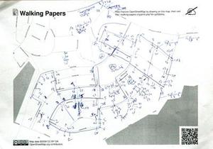
The reason I chose June 4th to make it live was the OpenStreetMap mapping party on June 6th, up in the Presidio Sports Basement store "big room". The event was the first public use of Walking Papers, and we presented it as a basic alternative to the usual GPS method of collecting map data. Several attendees jumped in, and we got a few excellent submissions including a survey of the marshy land east of Crissy Field and absurdly high detail of businesses along Chestnut St. These two scans were such a thrill: the technology worked and we got legitimately street-level data from enthusiastic participants!
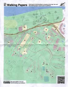
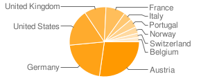
The most common piece of feedback I saw from users was to allow for landscape orientation in scans, so I added that feature this weekend. It's now possible to print maps in either landscape or portrait orientation, and the image recognition code distinguishes between the two based on aspect ratio. Users immediately started using the new orientation, including one German collecting house numbers:
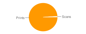
Generally speaking, we are seeing loads of prints and not very many scans. It's incredibly easy to hit the "make" button on the front page, less so to actually collect some useful information, so I'm not surprised by the disparity. I am looking forward to seeing more activity though, starting with a scheduled mapping party on June 27th and 28th at RPS.
We've seen some very welcome feedback as well.
Austria's ORF Futurezone published an article devoted solely to Walking Papers on the 10th, which explains the disproportionate presence of many Austrian prints and resulted in a huge traffic bump.
Stefan Knecht of Germany's United Maps said the project was "just lovely", which was very nice to hear from someone whose work is so vital and excellent for online mapping:
Despite or even because of this "post-digital, medieval technology"- it's simply lovely. The reduce-to-the-max, crispy clear website is why I deeply adore Stamen for.
OpenStreetMap superhero Andy Allan pointed out that "even if you don't want to scan back in, it's actually a good interface for just printing maps for annotation."
Jason Kottke also sent some link love our way, in a post also highlighting The Incidental, the post-digital newspaper project Schulze and Webb (and Jones and Davies) at Milan's Salone di Mobile.
So that, in a nutshell, is what is happening with the project. It's nicely steaming along with regular prints, we're starting to see scans from users, we're playing with some ideas on how to more effectively foreground the idea of annotations and scanning on the site, the code continues to be freely available on Github, and I'm actively trying to boost real on-the-ground use of the system for actual mapping.
Jun 18, 2009 6:55am
fever
Shaun Inman just launched Fever, a web-based feed reading tool that you buy and install on your own server.
A few interesting things:
- Fever implements SnarkMarket's "compress into diamonds" idea: When I click that button, spin your little algorithmic wheels and turn my reader into a personalized Memeorandum. Show me the most linked-to items in the bunch, and show me which of my feeds are linking to them.
- I always wanted to turn Reblog into something like Fever, but never did.
- It's written in PHP, which makes me happy. All this blibber-blabber about web-based MVC development frameworks, and PHP is still the works-everywhere-including-shared-hosting common denominator. It's truly the Bourne shell of the internet.
- The installation procedure, esp. the way it ties in with the main Fever website, seems to be a way for Shaun to watch his user base, verify that installations are paid-for, and smooth the process all in one shot. Is it also a way to push updates, and is the chmod -r a+rwX step a possible point of exploitation? Too early to tell. Watch the video on the site, the installation bit is at the end.
- It's being marketed and sold like shrinkwrap software but you need an account on the website to install and license it.
- The division of feeds into must-read and might-read is pretty reflective of how most people think about their feeds in my experience.
- Drag-and-drop on the web is stupid.
- The grouping of entries based on linking is, to me, more of a way to mass-delete things that everyone's gabbing about rather than a pointer to what's actually interesting. When I imagined doing this kind of cross-item-similarity for Reblog, I imagined it as a way to quickly identify pockets of groupthink or P.R. clusters and rapidly/easily eliminate them. Just think, I could have handily avoided last week's internet-wide Google Wave boner!
- I'd totally install and use Fever if I didn't use Reblog for publishing as well as consuming - all of my snippets and most of my Delicious links are tagged and published directly from my feed reader. It'd be cool if Fever could do this, maybe as a plug-in.
Jun 18, 2009 4:54am
people clouds
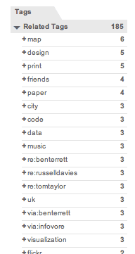
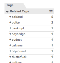
Delicious has a related-tags feature that I've been greatly enjoying since Rabble told me I should probably tag my links. Normally, the list of related tags is designed to suss out content, but I've been using people-tags in addition to topic tags. If I get a link from someone, I tag it with via:username. If I post a link about someone I know, I tag it with re:username. Related tags gives an interesting view on some of the folks I follow most closely.
I've only been conscientiously tagging my links for a few months, but already I'm starting to get a clear picture of the kinds of material I get from my friends. I love the idea that a nice stick-and-rock diagram can be made to sum up the specific expertise of people I know, and the topics I look for from each of them.
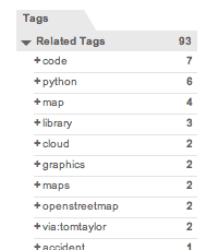
First though, I want to talk about how everyone I know is doing awesome shit. A quick look at related tags for this one shows who they are and what they're doing: maps, design, code, stuff about cities and paper, and a little cluster of Brits near the top. That group of three re:'s happens to be the Really Interesting Group:
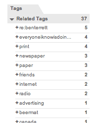
Looking just at links about Russell, you can see his co-conspirator Ben right at the top, a long with a short list of what they're thinking about: printing and newspapers and things that friends do on the internet:
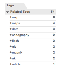
Aaron is all about the papernet in real life, but the things I really follow from his postings are the Python code libraries for doing cloudy stuff with maps:
Zachary Johnson, whom I've never met, is all about maps and cartography:
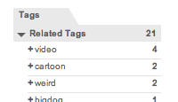
My brother Zak, on the other hand, is a primary source of weird animated video:
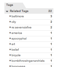
Fred meanwhile is Mr. Baltimore architect, and as often as not I repost things he writes himself:
Finally, top Oakland blogger V Smoothe is all about local Oakland business:
Do you tag your links like this? Does it help you develop a sense for those in your circle who are go-to people for certain topics? Does it help you get through your daily reading to know what certain people are best at? Don't you wish that Delicious would let you check your own name for the hive-mind consensus about what you're good for?
Jun 4, 2009 7:20pm
walking papers lives
OpenStreetMap, the wiki-style map of the world that anyone can edit, is in need of a new way to add content. I've been working on a way to "round trip" map data through paper, to make it easier to perform the kinds of eyes-on-the-street edits that OSM needs now the most, as well as distributing the load by making it possible for legible, easy notes to be shared and turned into real geographical data.
Walking Papers is a working service that implements this paper idea, based on initial technical experimentation from back in February.
Three Kinds Of Mapping
A rough road network of the United States has been basically complete in OSM for some time now, since the bulk import of the US Census TIGER/Line data set. This means that U.S. mapping parties can be slightly counterproductive: the party format was designed for places where raw GPS traces are needed most of all, and participants frequently create fresh data for a given location for the very first time. You show up, are given a handheld GPS device, quickly schooled in its use, and sent out on foot or bicycle or car to collect traces of nearby roads and pathways.
Because we taxpayers have funded the creation of free, public data for every road in the U.S., raw roads generally already exist in the database. TIGER data can be inaccurate, but with the gracious licensing of Yahoo aerial tile imagery, it's possible to correct misplaced roads without actually leaving your desk - simply use OSM's built-in editor to move streets around until they match those seen on the underlying satellite imagery. This kind of gardening or tending activity can be great fun in an OCD sort of way, and I've personally killed many hours moving nodes here and there to improve the accuracy of street grids.
There's a third form of map editing that I think is best addressed by paper, and that is the annotation of local, eye-level features that would be invisible on an aerial image, meaningless in the absence of base road data, and impossible to collect without a site visit: street lights, bike shops, restrooms, cash machines, stairs, cafes, pubs, addresses, and other bits of geographic context that make OpenStreetMap such a strong contender with the larger, commercial services at a human scale.
Fixing #3
Currently, there aren't any methods in place specifically designed to address this third kind of casual local mapping.
Walking Papers is a website and a service designed to close this final loop by providing OpenStreetMap print maps that can be marked up with a pen, scanned back into the computer, and traced using OSM's regular web-based editor, Potlatch. It's designed for the casual mapper who doesn't want to fill their pockets with gadgets to record what's around them, the social mapper who might be out and about taking notes and comparing them with friends, and the opportunistic mapper who might make notes during a commute or a walk if they had a notebook-sized slip of paper to write on. Finally, it's designed for the luddite mapper who would like to help the OpenStreetMap project but needs help from a distributed community to convert their handwritten annotations into OpenStreetMap's tagged data and local conventions.
I'm trying to bridge some of these uses with web service opportunism and old-fashioned undigital fulfillment. Each scanned map is reverse-geocoded using Flickr's flickr.places.findByLatLon API feature, which coughs up a meaningful local name for a given geographical area so you can look at a collection of everyone's scans and perhaps recognize a place you know and might help trace. Each print and scan action is also backed by a (possibly optimistic) promise to snail-mail printed maps to users, and to accept snail-mailed annotated maps in return. If you want to play neogeography pen-pal or simply don't have a scanner at your disposal, Walking Papers can help.
Context
The project is most particularly inspired by Aaron Cope of Flickr and Ben / Russell / Tom at Really Interesting Group, whose Papercamp / Papernet and Things Our Friends Have Written On The Internet 2008 help all this post-digital, medieval technology make sense.
I've also posted before about the underlying technology that makes this work, but I'll recap by saying that it's all off-the-shelf stuff built to run on crappy hosting. More information can be found at Github, where all the source code for this project lives.
Jun 2, 2009 11:17pm
oakland crime maps XII: the pie of time
We just made a substantial change to Oakland Crimespotting that addresses two big ideas: Big Time and Little Time.
Big Time is about history and trends, and you can see it in the newly-opened archives that offer links deep into the past of our crime database, from our first launch of the site in 2007, such as the assassination of Chauncey Bailey that first spurred us to release the project after I'd been personally collecting data for most of Spring and Summer 2007.
Little time is about the hours of the day, and the possibility of seeing neighborhood crime activity on a micro scale: your commute, your evening stroll with the dog, your morning run. The navigation concept we developed to support this is something we've been jokingly calling the "time pie", and it looks like this:
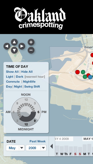
There's more about this on the Crimespotting blog, I encourage you to check it out.
subscribe to ![]() this site.
|
contact Michal Migurski
this site.
|
contact Michal Migurski